[quote=“hemancuso”]
This is nice. For me, though, it’s too dark the bottom, fades into my OSX dock (set to 2d). Also, I think it would be nicer without the “book” depth effect.
Thanks for sharing this.
[quote=“hemancuso”]
This is nice. For me, though, it’s too dark the bottom, fades into my OSX dock (set to 2d). Also, I think it would be nicer without the “book” depth effect.
Thanks for sharing this.
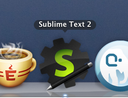
Well, here’s the one I’m using right now. Didn’t take long to create, and it’s not very adventurous, but it looks okay to me:
This is a very quick sketch of a puzzle-pieces type logo idea I had. I’m no artist, but perhaps someone else will make something cool out of the concept.
I have to save I rather like Nate Beaty’s, linked from here http://rathersplendid.net/home/customise-sublime-text-2
[quote=“handycam”]I have to save I rather like Nate Beaty’s, linked from here http://rathersplendid.net/home/customise-sublime-text-2
http://i.imgur.com/JjlFk.png[/quote]
This is the one that I use. I recently experimented with a different one, but came back to this one.
I prefer the dark gray variation of my icon:
Matches ST2 more imo, but their both still just temporary icons. I threw em together pretty fast.
Zips for the icns files are on this post: viewtopic.php?f=2&t=1558&start=40#p9365
[quote=“natebeaty”]I prefer the dark gray variation of my icon:
Zips for the icns files are on this post: viewtopic.php?f=2&t=1558&start=40#p9365[/quote]
I see no link to zips at that link, just part of this long thread. How about posting the link again?
[quote=“marksteve”]Took the slab idea into some perspective 

Screenshot:
http://i.imgur.com/CmiyR.png[/quote]
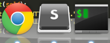
Using this.
Guys,… the new logo… the S in orange looks bad, and the perspective of the icon just dont work on my mac.
Also on windows 7 i use the bottom bar in small size and the new icon just suck… the white border appears as if the image doesnt load and the S is not visible, the previous icon, the darkblue was beatiful.
I know the people beside this new logo are brillant but this new logo just dont works…
So it seems a new logo has been picked? I use ST2 on windows and linux and they both come with this icon.
![]()
[quote=“marksteve”]http://f.cl.ly/items/013I0q210a372c2K391z/Screen%20Shot%202012-02-24%20at%202.08.27%20AM.png
Guess I got used to the monochrome.
Download: cl.ly/1D1p1N082w1m0X3k1C3V[/quote]
I’m liking the white S a lot. Looks great.
sublimetext.com/blog/article … build-2181
Have to say, that crisp, white S holds up a lot better at smaller sizes than the glowing orange S. I like the new icon and can certainly live w/out any tweaks, but it does get blurry at smaller sizes.
The font used on the apple keyboard is VAG Rounded. The one in the icon looks to be a bold version of that, not comic sans as mentioned before. I agree the white “s” looks classy. I wish icon factory had gone for realism.


It looks elegant in the dock, no?

Even unbolding it and making it look more like a macbook key looks nice on the new icon. Can’t go wrong from “borrowing” from apple’s designs right?
I’ve made this some time ago. It’s the old icon with letter “S” and “T” merged together – looks kinda like reversed question mark 

[quote=“phillip.koebbe”]
This is the one that I use. I recently experimented with a different one, but came back to this one.[/quote]
+1
[quote=“chrisguilbeau”]What about the real “S” key from your keyboard
LOVE (almost there, maybe lacking a bit of body, but the best so far)
[quote=“willy1234x1”]
Inspiration from Adobe icons.
Icon used is from iconSweets2
VERY nice, care to share the actual icon with us, so we can use it for the time being, while we wait for the name and icon to be changed for the final release?
I second this motion, that’s a wonderful icon and very fitting for Sublime Text.[/quote]
This looks really good, but it’s too fancy and finished. it needs to be something stripped out, minimalistic and lightweight, yet beautiful.


