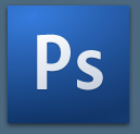
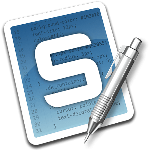
[quote=“doppopp”]http://i.imgur.com/tjfAO.jpg
Inspiration from Adobe icons.
Icon used is from iconSweets2[/quote]
I think that is the logo that should be used, it fits Sublime Text perfectly! No strange colours, images or type, it’s simple and an evolution of the current design.
I would say that the light grey area on the left hand side should be removed, and possibly a very subtle gradient from the top left to bottom right to help curve the front of the logo, similar to the CS3-4 logos…

After that, it would be useful to see it at the correct size for Windows 7 task bar and a standard OSX dock icon, to be sure that you can see the top part of the logo clearly.
Great work though, definitely gets my vote!

