Hi folks, first off, thank you for Sublime Merge. It sits on its own monitor as I develop and I wouldn’t want to be without it (just upgraded as my 3-years had expired).
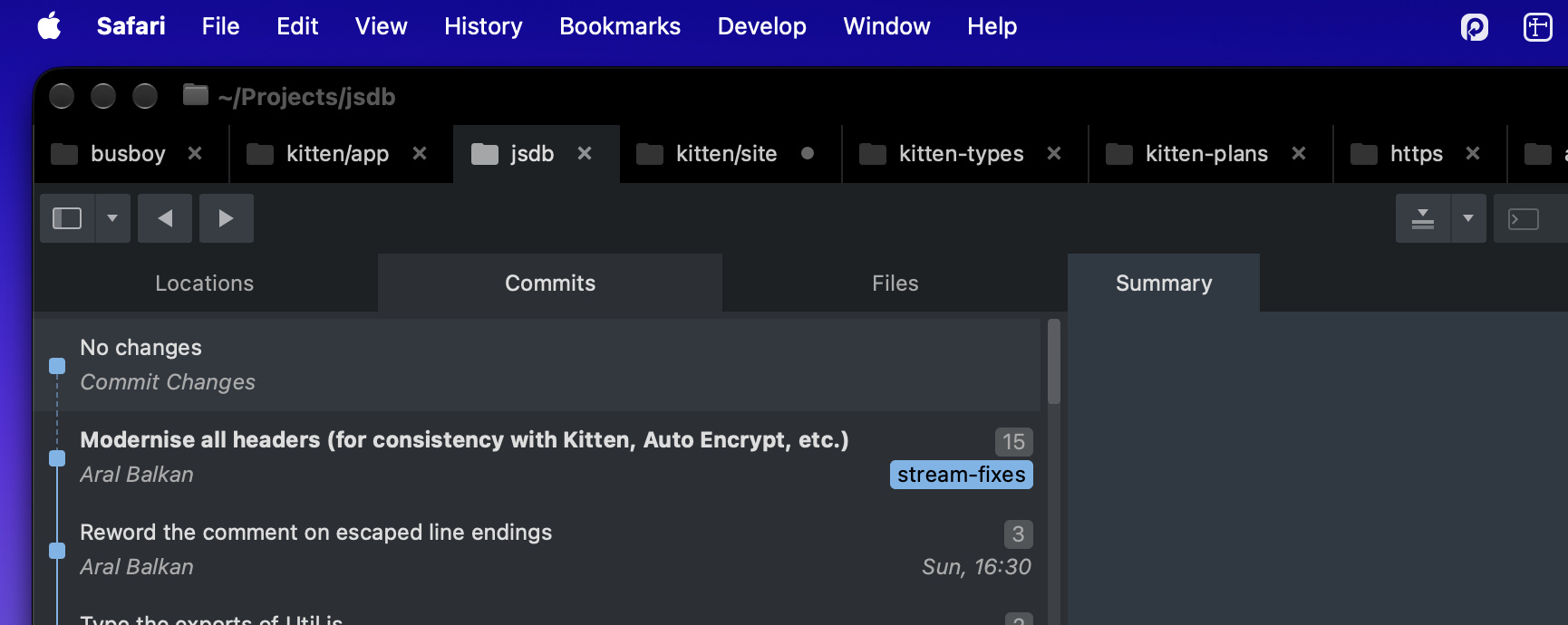
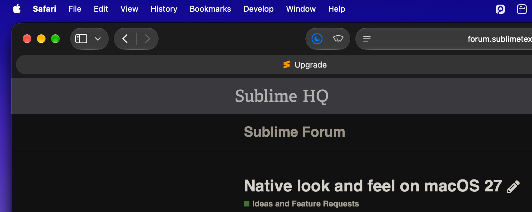
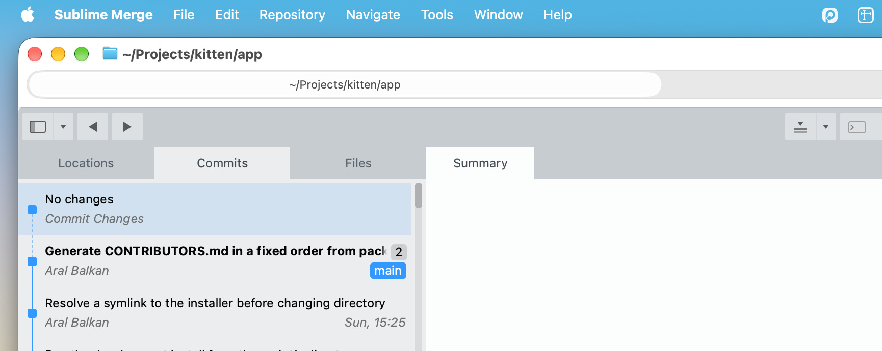
I also just upgraded to Golden Gate and while I see that 2132 has a change log entry for updating the window for macOS 27, I just wanted to say that it still doesn’t look native and sticks out among all the other windows. Mostly because of the lack of spacing in the title bar and the non-native tab bar elements, etc.
Previously, I was on Sequoia (skipped Tahoe entirely) and it wasn’t that big a deal but it really looks inconsistent with their new design language (like it or not; personally, I’m glad they toned it down in 27).
In any case, would you consider at least making the padding in the title bar consistent with native apps? (Tab bar, etc. is likely a far greater task.)
Given it sits stating at me all day, it would be nice if it blended in a bit more with the rest of the system.
No worries if not – first world problems and whatnot 
PS. Attaching screenshot of Safari vs Sublime Merge on macOS 27 for comparison.
PPS. Thought I was but apparently I can only attach one image sigh