Sublime Forum

Indentation guides break with one specific font

#1

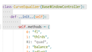
I use the font “Input Mono” and the indentation guide lines get a bit odd:

At line 7 it draws the guides over the text and that guide remains active for lines 9 and 10 instead of the next indentation level.

This does not happen with other fonts I tried.

Link to font: http://input.fontbureau.com/download/?customize&fontSelection=fourStyleFamily&regular=InputMono-Light&italic=InputMono-LightItalic&bold=InputMono-Medium&boldItalic=InputMono-MediumItalic&a=0&g=0&i=serifs_round&l=serifs_round&zero=slash&asterisk=0&braces=0&preset=default&line-height=1.3&email=

Edit: Testing in ST 3 dev build 3142

1 Like

#2

what ST build are you using?

0 Likes

#3

Edited post, thanks. I’ve had this issue for a long time. I always assumed it’s some plugin, but yesterday finally isolated it to this one font (which I like too much to give up)

1 Like

#4

Yeah, I’ve seen that too. It depends on combination of “font_face” and “font_size”. Try to tweak the “font_size”.

E.g. if you use "font_size": 10, try to set 10.5 or 9.5.

2 Likes

#5

Great, thank you. That actually worked.

I’ve set the size to 10.5 - it renders the same size as 11, but the indent guides are correct now.

1 Like

#6

For the record, changing the font size helped, but the issue does still appear in much deeper indentation.
This also happens with Fira Mono, but not Consolas (all this on Windows 10).
So while it’s better now, it would be nice if the font quirks don’t affect the indentation guides. That said, the same font in different applications often shows some tiny difference here or there so I can accept this as just the result of combining ST3 with this font at this size etc. For now, Consolas it is.

From a very small amount of debugging armed with very little knowledge of how fonts work, I think it’s caused by the font when it has a negative leading value. I only saw this when picking a font in mintty (msys2) and only if you close and reopen the setings dialog. The leading value seems to change if you change the font size. A value of -5 has a much worse effect on the guide lines than -1.

0 Likes

#7

Another update: I changed font_options from subpixel_antialias to gdi and now the indentation guides are correct. Some fonts get a different line spacing with this, but the line_padding_* settings let you control that. So now I can use whatever font is my favourite at whatever time.

0 Likes

Misplaced indentation guides
#8

Using gdi produces different looking text (wider in my case) and I couldn’t get used to it so went back to subpixel_antialias and just ignore the invalid guide lines. A fix would be much appreciated though. :slight_smile:

0 Likes

#9

I’ve had the same problem with different fonts (Source Code Pro and PT Mono) and on OS X. More details here.

ST3 Build 3126
macOS 10.12.6 (16G29)

0 Likes

#10

I came here to report this same problem. Happening to me with font-face “Hack.” Changing font_options did nothing for me, neither does changing font_size.

ST3 Build 3143
macOS 10.12.6

0 Likes

#11

This is a known bug with the Hack font, and the author of the font has fixed it. According to him, you should deinstall the font and install the latest version.

0 Likes

#12

That helped. Thank you!!

0 Likes

#13

The Hack font does look correct, but there are other fonts that don’t and I doubt they’ll all see the same enthusiasm from their authors. So while SublimeText is not at fault, it would be nice if it could somehow work around “broken” fonts.

For reference:
I see it with font_size 13, 14 (and others) on fonts “Fira Mono”, “InputMono”, “Monoid”, “Source Code Pro”.
SublimeText Build 3144
Win 10 Pro (no Windows Insider updates)
Monitor scaling set to 100% (recommended for my screen is 125% where the issue looks the same).

0 Likes

#14

If you can find an issue, or create a new one, and add details and screenshots, we can check it out at some point.

0 Likes

#15

A new one where?

I have found that this only happens if you indent with spaces. It doesn’t matter what the indentation setting is, if you just type a lot of spaces the indent guide goes off. I checked the middle dot (0xb7) character in font-forge and the width is the same as other glyphs, so I don’t yet see any reason for this font to be different from other fonts.

0 Likes

#16

I think I’ve identified the font “problem” - em size not a power of 2. The Input font I use has an em size of 1100. Source Code Pro and Fira Mono have an em of 1000. Consolas and Hack have an em of 2048.

I opened the Input font with FontForge and changed the em size to 1024 and let it transform all glyphs. I then saved it as a TTF font. Doing this with 1100 warns that the TTF convention is to use a power of 2 em:
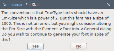
While a power-of-2 em does fix the indentation guides, it makes some glyphs look very wrong. So as was said before, the one option is for the font author to fix the font by following convention and fixing up glyphs to match. The other is for Sublime Text to handle fonts with em of unconventional values (Fira Mono/Code, Source Code Pro, Ubuntu Mono all use 1000, Input uses 1100). The last option is for the user to avoid these fonts.

All that aside, it looks like the recent font rendering rework makes em 1000 fonts work correctly. It looks like 1000 is an accepted non-conventional value and popular, while 1100 is just outright weird. This means most other popular fonts now work correctly.

Note lines 4 and 7 using build 3143 with Fira Mono size 13:

and build 3147 with Fira Mono size 13:

0 Likes

#17

Build 3149 no longer has this issue with any font. :tada:

I don’t see anything in the changelog specifically for this, but whatever changed worked and I really hope doesn’t change back. :slight_smile:

Thank you.

0 Likes

#18

This was something I specifically fixed in 3149; it won’t be coming back. Sometimes I forget to add things to the changelog :slight_smile:

4 Likes

#19

The alignment is still off for me in build 3156 (Mac) when using a semi-proportional-spaced* font. I have made sure that all whitespace characters, as well as periodcentered and other punctuation have the same width.

Is there a special character or value that is measured in the font for this indentation position?

* Most glyphs in the font have the same width (560 units on a 1000 unit em), but some are narrower (i, l, etc.) and some are wider (M, W, ...).

0 Likes

#20

You should see notices in the console if the font is not detected as monospace.

We compare the width of i and m to detect if a font is monospace. For tab widths and space widths, we measure the width of the m character.

0 Likes