When looking up symbols in a project, when there are many matches it makes it impossible to see what the symbol or the context of where it’s defined because the drop-down is covering most of the screen.
For example:
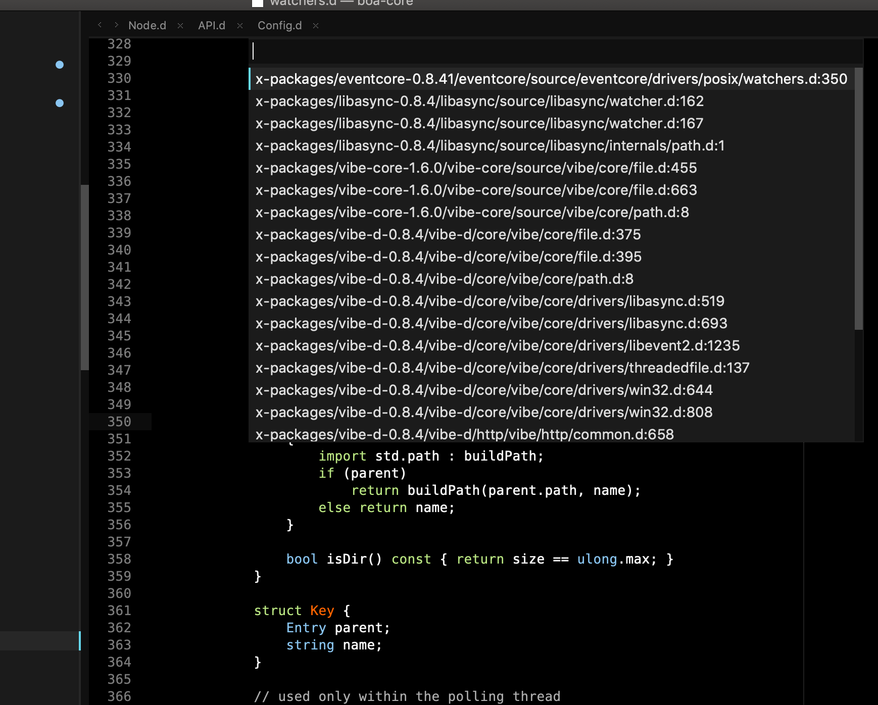
It would be good to either make the list of symbols transparent or limit it to a small number so it doesn’t cover the entire screen.