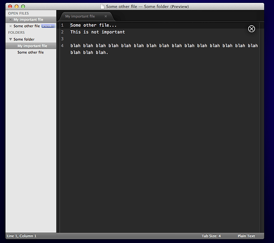
This is a culmination of Ideas and Feature Requests I have either had myself or come across from this forum (some of which I have mentioned in posts that have been lost or ignored). It is more or less a vision I have for seeing ST2 improve and become more [new] user-friendly. Feel free to offer feedback, add to the list, or criticize my artistic vision.
-
Improve the sidebar:
a.)clicking a folder should add focus to the folder AND expand/collapse it.
b.)user should be able to select multiple items using shift + arrow keys
c.)users should be able to designate keybindings for when the sidebar has focus (example: command+d could duplicate currently selected file)
d.) there needs to be a visible indication for when the sidebar has focus (e.g. change color of selected folder/file) -
Improve Preview Feature:
- Add visual indication of the view is showing a view or a preview. My advice would be to add an ‘x’ to the top right of the preview, which when pressed would close the preview and return the view to any overridden files. Perhaps add some extra drop shadow to add the impression that the preview is merely on top of the view and the previous file has not been lost (this can be confusing for new users).
-
The active view should have some type of highlight/outline to distinguish it from all the other views.
-
Better support for custom layouts. For example, some modifier keys + arrow keys could split the current view in the given direction. This makes more sense because rarely do I think, “I could really benefit from a 3 by 2 layout right about now.” Rather, I think, “I wish I could easily split the view vertically/horizontally.”
[COMPLETE] 5. Fix renaming: renaming a file in the sidebar should update the tab if the file is open. This is definitely the expected behavior and the current implementation is frustrating at best.
- Add support for anything wuub wants because he put a goddam terminal inside Sublime! And I want to play with it

- This means adding Sublime.DRAW_RECTANGULAR_NO_BORDER
[COMPLETE] 7. New Icon. Now hear me out on this one. I know you might want to wait on that until a stable release of ST2 is out (as it non-beta) but there are implications. I know from experience that most Mac users are extremely conceited when it comes to icons and are willing to dismiss an app based solely on its icon. My recommendation is try a new icon and if people come to a popular consensus about another one, just switch. All this icon testing should be done on the dev channel as to not confuse users and work on rebranding your icon. cough You should definitely consider this icon by this amazing artist of whom of I have no connection to: boundincode.com/img/Portfolio/portfolio5.png cough
-
New website. You have many talented web-designers at your disposal who are willing to help. This is another thing I’m sure you planned on doing towards the release of ST2 stable. This would make the most sense because all the Sublime Text 1 stuff needs to be removed first. You probably don’t need to have the default home screen showing Sublime Text 1 anymore.
-
Docs

I’d offer to help write some documentation, but I can only write sarcastically
If I missed anything major, I’ll consider adding it to the list. This list is not meant to sound negative or condescending in any way. This is just the direction I’d like to see this beautiful piece of software moving in.
P.S. Whenever I say “you,” I’m talking to Jon. That’s right, I talking to you Jon.


