Hi,
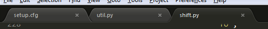
I just downloaded ST2 today after getting frustrated with TM for the 100th time. I’m liking what I see very much. As with TM, I immediately sought a way to make the status of tabs clearer (I think the default behavior is way too subtle for easy scanning).
Two tweaks:
- Active tabs have a bright green bar at the top to make it stand out
- Dirty files have a red/scarlet circle instead of the subtle gray circle
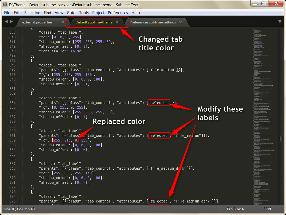
Below is my first crude attempt at tweaking some of the tab resource images. The above version is what I was using in TM, and the bottom is the quickie ST2 version (the green on the edges of the tab need better tapering, IMO).
If anyone is interested, I can find a way to make these available.


