It is wonderful that we can all play with Sublime colors. It teaches one much about the structure of this application. So we are constantly wondering why theme implementations burned out in the gutter, so-to-speak. But just look at this clip!
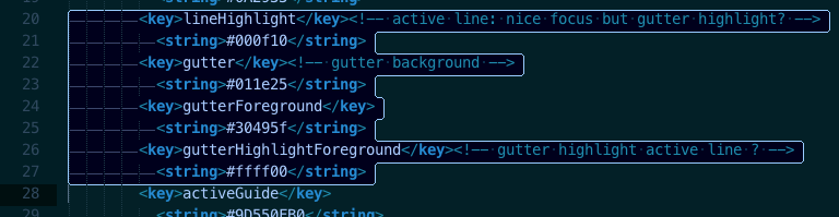
The first thing we notice, is that the wacky gutter-number highlight and cursor have runaway together, way South of our selection. Not understanding the fine nuances of operating systems, that looks WRONG! Every line selected should correspond with a highlight of every selected line’s gutter line number. Further, when the carat rests in any line, then the line number for that that active line should be differentiatiated in some way. Except of course, that the carat and gutter highlight should not be running away south of where they belong! Our selection processes should result in the following Gutter Appearance.
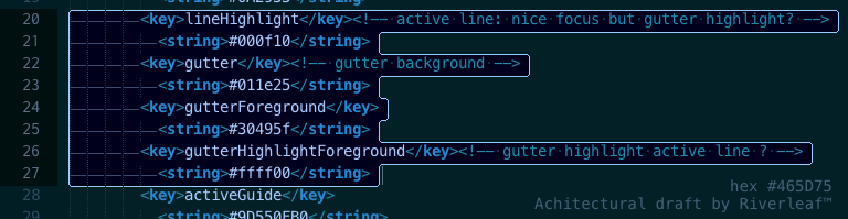
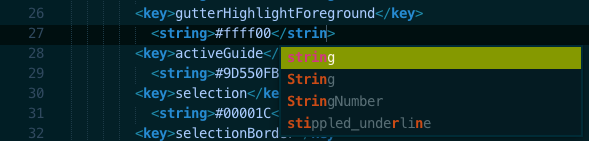
In the above (imaged) string arrays, we have attempted to activate the ENTITY.Highlight.Foreground feature, unsuccessfully. If you have very sharp eyes, you will notice that the cursor has been appropriately re-positioned where it might sensibly fit, in the bottom (corrected) image… Following the provided help files for Color Schemes and for Scope Naming, we are not having much luck there, at all. Does anyone know how to style the color for active gutter numbers: ergo, carat present OR line (s) selected?