Sublime Forum

Git File Status Badges

#1

Happy to see git getting a first class integration into Sublime Text, but I’m not a fan of the git file status badges’ placement. Because they are right aligned in the Sidebar, I end up associating them more with the lines of the file that is open and less with file/folders in the sidebar they are supposed to alluding to.

I noticed for files/folder that are gitignored, their names are slightly gray with no badge. I feel like a similar styling for the other statuses (orange for modified, green for new, red for deleted, bold for staged, etc) would work a lot better.

PS keep up the good work!

4 Likes

#2

so customize your theme :wink:

3 Likes

#3

Is it possible to show the git status badge also for the “Open Files” sidebar section? I would find them even more useful there.

1 Like

#4

I don’t think it’s the placement, it’s the color. When files are modified you can set "highlight_modified_tabs": true in settings which adds a blue color to tabs that have been modified.

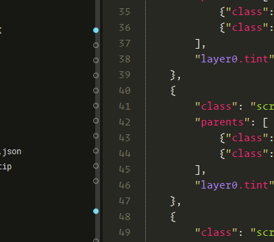
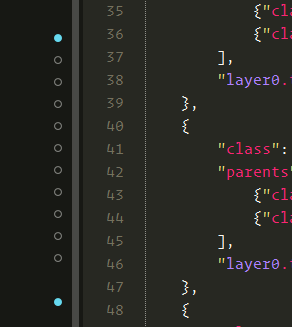
Another issue I have is that when a file is modified, all it’s parent directories get a dot as well. This makes sense when the directory is collapsed, but when you have expanded a bunch of directories they all get a blue dot, which makes it seem like you have a lot of modified files.

3 Likes

#5

i don’t need the dots, so i disabled them by setting "layer0.opacity" to 0

0 Likes

#6

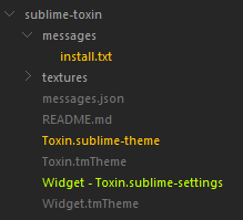
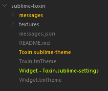
Here’s how I added support (for Git atleast) as sidebar text-only coloring:

And here’s how I made it so it doesn’t apply to folders, only files:

0 Likes

#7

Do you think there’s a way to still show modified directories when they’re collapsed?
Your theme looks nice by the way :slight_smile:

0 Likes

#8

Should be possible by adding a copy of those lines, change !expandable to !expanded (or something like that).

0 Likes

#9

@Jespertheend

-> ->

0 Likes

#10

Placing the badges at the right side is the only logical position and very correct. Maybe the right margin could be tweaked a little bit to avoid overlay scrollbars to cover the badge icons.

without overlay scrollbars the margin is already ok.

Themes will do the rest as we already see.

0 Likes

#11

This should just require a tweak in the theme to set the right content margin when using overlay scroll bars. If you open an issue on the core tracker, I can more easily remember to take care of this after dealing with some of this Wayland stuff.

5 Likes

#12

Debatable.

I too, as the OP, keep confusing the gutter indicators with sidebar Git indicators, even when there’s a scrollbar between them. 7 days later and I’m still getting distracted regularly.

I guess this could be attributed to years of reliance on the gutter (GitGutter, SublimeLinter, etc.) and it’s possible to get used to it, but I’m not holding my breath, it’s no surprise that two columns of attention-grabbing icons 10-20 pixels apart happen to blend with each other in the peripheral vision.

1 Like

#13

I feel similar to you and thus I switched to the toxin theme esp. thankfully since @p3lim integrated the “vcs_color_expanded” option which makes it really great for me and my daily work.

0 Likes

#14

First of all: The icons can simply be hidden by themes as folder/file icons can. A little badge can be as distracting as coloring each file in the tree differently according to its status. If any visual effect is considered distracting, there is no room for creating a GUI.

While you call 2 columns of gutter like icons distracting a long hanging feature request is to add a second one to be able to see e.g. GitGutter and SublimeLinter icons next to each other for a line.

So whatever is implemented someone will like it someone not.

I prefere folder and file icons to be visible in the sidebar others hate them. Same with the badges.

The only important things are to have such GUI entities available, to be able to customize or hide them.

0 Likes

#15

Yes, this is a great step forward and I am very glad to have it.

0 Likes

#16

Definitely appreciate that this is part of Sublime Text and that there is some customization.

I personally ended up modifying the Adpative Theme to handle Git Statuses more like how Atom handles them (colored icons and names).

I feel that a lot of the confusion comes from a loss of context:

  • The badges are distant from the files/folders they are referring to (the wider the sidebar, the worst this effect is).
  • The staging badge (an arrow-like shape) is pointing away from the name and towards the contents of the file.

Like anything some people are going to love it and some will hate it. Hopefully this thread will give them some insight on what options they have. Adding a setting to disable it and/or adding some information to the docs might also be helpful.

Also a big thank you for all the responses.

1 Like

#17

Many people compared ST’s with VS Code features. The badges are just follow the VS Code way of highlighting modified files, I think. Agree, this is a new feature which needs to be implemented by the themes in proper ways.

Just would like to see a common setting to be used by all themes.

0 Likes

#18

I just upgraded to the dev build with this feature a few minutes ago and these git badges are driving me crazy.

It’s mainly how prominent they are and particularly how big and bright the icons are. It makes them extremely distracting compared to everything else in my editor that I would like to look at, like file names and code. [But also that I use Tower for version control and don’t really need / want this extra feature in Sublime on top of what I already have. I much prefer the more subtle approach of GitGutter.]

I’ve dug through the menu bars and user settings but cannot find how to turn off all Git Status Badges in the side bar. Is there a setting I’m missing?

0 Likes

#19

I think the setting you’re looking for is this one; as seen here it defaults to being turned on:

    // Shows git repository information next to files in sidebar and in
    // the status bar. Sublime Text has to be restarted for this to take
    // effect.
    "show_git_status": true,

Note also that it’s possible to modify the colors used by the icons by editing the theme, although it’s easier to just turn them off if you don’t need the feature at all.

1 Like

#20

Thank you, that’s exactly what I was looking for. That worked perfectly after restarting Sublime.

How’d you find that setting anyway? I don’t seem to have it in my default Preferences.sublime-settings on Dev Channel build 3189.

Before your post, I came up with a temporary workaround of duplicating the Adaptive theme with PackageResourceViewer and setting "layer0.opacity": 0 for all of the entries of "class": "vcs_status_badge" in Adaptive.sublime-theme (referenced in a file linked above) which does effectively hide the icons, but your solution is much cleaner.

0 Likes