Hello there.
I installed Sublime Text 2 (build 2126) to do PHP development, but I discovered that the font rendering is not perfect in Windows XP:

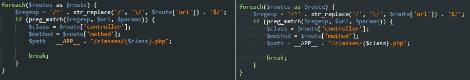
Left: Sublime Text 2
Right: Notepad++
The font in the right looks much more clear to me, while the left one looks more thick and it has smudges along some glyphs. I am using the font Consolas at 10 points. I tried all the antialiasing options, but there were no difference. Well, not exactly, subpixel_antialias did look different, but not better, at least in my screen.
Is there any other setting for the font rendering that I may be forgetting and can help me reproduce the rendering in the screenshot of the right?
Edit: okay, it looks like combining subpixel_antialias + bold somehow produces a rendering very close to the target:
Not exactly the same, but that’s enough for me
 If somebody has any other suggestion about this topic, be my guest