Sublime Forum

Draw_white_space dots get much bigger in 3143

#1

Hi!

After updating to 3143 style of dots showing whitespaces significantly changed. Here are screenshots (3143 - left, beta - right).

Leading dot’s are no longer faded for comments and they got 6 (six!) times larger.

Can this be fixed with theme/color scheme/plugin?

Thank you.

0 Likes

#2

other people have also requested that they can be made smaller again

AFAIK it’s not currently possible to configure it

0 Likes

#3

Which OS, screen resolution, DPI scale do you use?

The dots look very normal on my Win64 fullHD screen with dpi_scale 1.0

@insiders: Might the fading be related to the comment scope, which starts with #?

0 Likes

#4

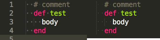
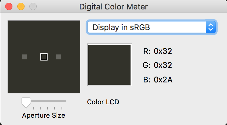
Macbook pro retina, 227dpi, OSX Sierra.

To be clear: the left image is how it looks now after update. The right one is how it was (i’m not sure, maybe build 3047). This is the only version prior release i have, other ones are not available for download on sublimetext.com. However st2 is still available for download and code looks same as on the right image.

Can you please check if spaces are shown in similar way in st2 and st3 for you?

About faded spaces. I’m not sure if it was a bug, but it was really handy to have them faded at the left from documentation blocks.

Thank you!

0 Likes

#5

According to dpi_scale. I was not aware of this option, and there is nothing about this option in default preferences description. I’ve checked different values and this dots are scaled along with other elements.

0 Likes

#6

I guess you don’t need to care about this setting on OSX. It was designed for Windows versions as Windows is/was a bit stupid when it comes to scaling content to high resolution displays.

In ST2 and ST3 3126 the dots are even larger then in ST 3143. I’d rather tend to call them too small :slight_smile:

3047 is quite out dated and much effort was put into supporting high-dpi screens in the mean while. So I wouldn’t use that to compare.

Maybe something went wrong with tuning scaling factors of the dots.

0 Likes

#7

Seems like it’s platform specific. From comment shared by @kingkeith it seems that in mac os they get large in 3132, but you say that in windows build 3126 they are even larger.

Looks like that in 3132 they started look the same on both platforms, larger than on macos but smaller than in windows.

Do you know if this can be fixed with a plugin or this is st-core issue?

0 Likes

#8

All graphical rendering is done by the core, and can’t be changed via the API.

The way to “resolve” this is to have the font you are using not have such large middle dot character. http://www.fileformat.info/info/unicode/char/b7/index.htm. Unfortunately I realize this is not possible for many fonts.

The current implementation at least gives some control to the user since they can switch fonts to one that is more their liking, and Sublime Text respects the dimensions of the font you are using, rather than just drawing a 2x2 px dot on the screen no matter what.

3 Likes

#9

Thank you for explanation.

Switching font is not as easy as it could be. I’m not sure if image would be ok for this purpose, but at leas giving opportunity to style this elements (decrease font-size) would be great :slight_smile:

It’s even greater if it’s possible to have this dots faded for comment lines again (via styling or somehow else).

If this is not possible, can ST provide setting to switch back to previous behaviour and draw dots itself not using font?

p.s. I’m not sure if this is because the dot size was not adjusted to dpi, but i had them 1x1 (not 2x2) and liked it so much:

0 Likes

#10

I use Roboto Mono Light which renders the dots well. Couier New is ok, too.

With Consolas they are rendered quite large.

I think the decision to use a font glyph was made to scale the dots with the font size and dpi easily and efficiently as you just need to tell the engine please render font 0x7b instead of 0x20. I would have made the same decision :wink:

Maybe we just need a “dot_font_face” setting, so everyone can decide which font to use and whether the dot should be round or sqare or whatever?

1 Like

#11

Roboto Mono Light works fine for this.

0 Likes

#12

Bumping in support of configurable whitespace dot size. The increased size in 3143 is honestly preventing me from upgrading at the moment.

0 Likes

#13

Strangely in 3144 on Windows I don’t see ANY dots (I do see tab lines though). On Mac I see the small dots.

Edit: Nevermind, fixed it by removing the font_face preference which I had set to ‘Hack’, and it was causing other weircd spacing as well.

0 Likes

#14

Hey there, we’re a few weeks out from 3.0 release at this point. Has anyone found any good solutions to this so far? Seems ridiculous, but I’ve found it to be pretty frustrating.

0 Likes

#15

you can change the color and opacity of invisibles in build 3149 (in the color scheme), or ofc you could edit the font to make the middle dot glyph smaller

0 Likes

#16

I edited the dot glypy(unicode 00B7 and 2219) in consolas font file,

now it’s ok.

font file with smaller dot

1 Like

#17

I’m having a very similar issue. In my settings I have "draw_white_space": "all". Since updating to Build 3170 however, I’ve had to turn it off after trying for hours to get the white-spaces in comments to be less intrusive. I tried editing the opacity of the invisibles parameter within the Monokai color scheme to no avail. Below I’ve included screenshots on Windows 10 which clearly show the difference in opacity for white-spaces in comments being different before the update.

*Since I can currently only post one image per post, I will include the “after” in a following post :confused:

0 Likes

#18

0 Likes