It would be great if a dotted line would be added to the sidebar that shows which files belong to which directory. I don’t know what else to call it but a “dotted line”. What I mean is that when you unfold a directory in the sidebar view, a dotted line goes down from that directory and then to the right, pointing to the files in it (one horizontal line for each file). Because now - to my head - it’s kind of a chaos when I have a lot of folders unfolded in the sidebar view.
Dotted line in project sidebar tree view
[feature request] projects sidebar: vertical lines to visualize indentation better
Sidebar question
Interface Suggestions
One year and three months later, same here, I have been looking for the functionality and only found this unanswered thread.
I wish we had the option to display lines in the file tree to be able to spot easier file locations, like in QT Creator.
I guess you usually respond to an idea only if it’s something you consider doing at the moment, but it’d be cool to have a bit of feedback from you on these visual tweaks. Is it something you would add in the future when you have the time?
I’ve been using Sublime Text 3 for almost 10 years, every day, but its the first time I needed this dotted-line feature.
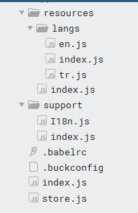
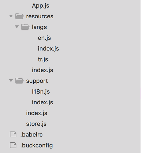
JS projects usually have both folders and files in same directory, and that makes my eyes dizzy. See the screenshot below. You can’t easily tell if the “support” folder is in the “resources” directory, or which is the parent of that index.js files. That is also harder when you have a 27" or larger screen and the sidebar is on the most left edge.
Btw the screenshot is just a simple one. Think about more complex structures that JS projects may have.
Not even the current Windows 10 Explorer uses dotted lines anymore.
But you are right, your folder structure is hard to follow, because of missing file icons. Not sure which theme u use, but IMHO it should either hide all or display all icons.


