Dev Build 3162 is out now, with details at https://www.sublimetext.com/3dev
Dev Build 3162
Some other editors call it Semantic Highlighting. It is when each identifier is given a different color on a gradient, or series of gradients. The conceptual benefit is that similar identifiers will have different colors, and you’ll be able to glance at code and have a better sense of where a variable is used.
Sublime Text added support for this with the .sublime-color-scheme format.
From what I see hashed syntax seems to assign colours to expressions for faster recognition instead of fixed colours for syntax expressions.
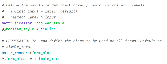
=> See mattr_accessor and mattr_reader
With this build, my input and scrolling is noticably delayed / choppy on Windows 10. It seems to be related to the size of the file. With a new file, input and scrolling is fine, but once you add enough text to fill the screen, everything is delayed. It’s not related to the syntax of the file or the theme either.
Just created a new account to corroborate @Narretz: Windows 7 x64 professional here, all scrolling is completely messed up. Looking at the changelog I would guess this is due to the DirectWrite changes. I rolled back to 3161 before I could try a fix because I need to be working on my stuff this morning.
Thanks for the reports - I’ll do a new build tomorrow with a fix for the Windows perf issue
Dev Build 3158 Through 3162 does not work on FreeBSD, however Dev Build 3157 does work without issue
We don’t directly support FreeBSD. Are you seeing any errors when starting to load it?
3158 changed some things related to inotify, and added a dependency on some (new to ST) pango functions, including an optional dependency on one function introduced in Pango 1.38.
If you want to keep discussing, let’s start a new thread separate from this build thread.
It looks like this bug is fixed Dev Build 3158, the fix appears to have introduced some visual artifacts:
The selection overflows the highlights (double clicking a string to highlight others):
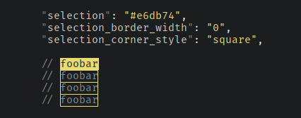
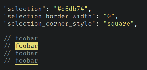
A related issue is that square selections are actually rounded at the bottom corner of the end of a selection.
A left to right selection:

A right to left selection:

Ah, my cursor is the same as the selection: #e6db74.
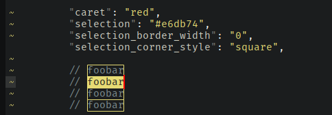
I use a slightly adjusted caret so that the I-beam doesn’t overflow the top or bottom, I was using these settings:
         "caret_extra_bottom": 0,
         "caret_extra_top": 0,
         "caret_extra_width": 1,
Which now leaves the I-beam off-by-one:

But I’ve changed it to these:
        "caret_extra_bottom": 1,
	"caret_extra_top": 0,
	"caret_extra_width": 1,
Which solves the selection rounded corner issue:

Why do I use the same color cursor as the selection?
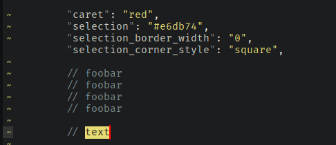
It’s a trade-off for vim-mode to try get the best block cursor as possible. For example, if you make the cursor red, this is what your block cursor in vim-mode will look like:
The background of the cursor is the actually same as the selection color. You can change the background of it by changing the selection color. The cursor color is the underscore part of cursor. Vintage uses the inverse_caret_state setting to mimic a block cursor: view.settings.set('inverse_caret_state', True).
If you set the cursor the same as the selection then you get block cursor like this:

Of course you can’t see the cursor in selections, which is a bummer:

I prefer the trade-off of a better block cursor.
The selection is 1px taller than line height so that when selecting the end of a line and the beginning of the next, the borders perfectly overlap.
Is that why we get the line joining the selections?

I’d prefer not to have that joining line.
Then it wouldn’t be possible to tell if you have a single or multiple selections. Either way, for now it is not an option to remove it.


