Depending on the color theme, the highlighting changes can be nicer than what was in previous builds.
For example, with the Solarized (dark) theme I use, the foreground color is preserved with the word-highlight plugin.
3148:
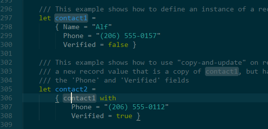
3143:
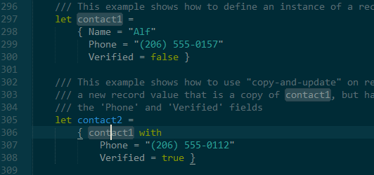

Depending on the color theme, the highlighting changes can be nicer than what was in previous builds.
For example, with the Solarized (dark) theme I use, the foreground color is preserved with the word-highlight plugin.
3148:

3143:

No. I think it’s just a choice between the following two
contact1 in syntax highlight.contact1s quicker.
I almost cannot tell what you selected is contact1 in the above screenshot.
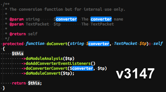
However, I can see all selections at the first glance and know they are converters.
The “old” behavior from the dev-build 3147 when selecting single characters from ligatures was more straightforward (essentially the ligature was removed when the selection is active). Any chance to get that as an option back?
I think both of those are bad. 3148 is worse because at a glance the it looks like the second one is selected.
Find
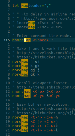
I’ve already noted that selection and find highlighting is bad. One reason is because you can’t color the background of the occurrences i.e. the one’s that have a border.
Here’s search in NeoVintageous, this is broken in 3148, I assume because of whatever has happened to regions:
Press / to search, and type “key” in the search input:
Now press Enter and then n to cycle forward, N to cycle back.

There’s still outstanding issue which is that the current occurrence should be blue like the first search match. I’m pretty sure it’s possible to do. Maybe not 3148.
Incidentally, you’re using Solarized. I wanted to change Solarized for NeoVintageous search to have the following highlighting. Where the first image is the search match and the right is occurance. It mirrors the search highlighting in Vim solarized.

It looks better in vim because the selections are not rounded in Vim:
Just my two cents. I don’t like how popup drop shadow looks like on Windows now:
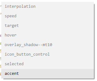
Is there any chance that tool_tip_control and popup_control will act like overlay_control:
Default & Adaptive themes provide optional texture with the shadow.This allows to control that shadows easily from the theme side, theme developers even will be able to use hidden "draw_shadows" setting to enable/disable them.
Yeah we had hat discussion (about Solarized) and I think it’s a pretty bad idea to lose syntax highlighting in selections, especially if you’re selecting multiple lines. It’s a trade off of course, horses for courses and all that, but I don’t see how one can be such a fan of ditching syntax highlighting in selections.
"font_face": "Consolas Bold" is broken again (text displays no differently than when it’s simply "Consolas").
This was previously fixed in Build 3140:
Windows: Fixed selection of Consolas Bold on Windows 7
But Build 3148 has regressed.
I don’t see a reason for not splitting up ligatures when a selection intersects them partially. I can’t even imagine how it could not look broken since ligatures fundamentally disregard character bounding boxes.
If ligatures were split again for the selection, there shouldn’t be implementation issues with a selection foreground color either, unless im missing something here.
This was initially my thought, but it ends up causing various issues. Take the ligature for ... in Fira Code. If you had a sequence of four periods, ..... Without a selection, you’d have the ligature for ... followed by .. If you selected the first ., you’d now want . followed by the ligature for ...? Also, the ligature for ... shifts the letter spacing of the dots, so as you make a selection the periods would be jumping around.
However, this also doesn’t take into account other complex text layout that we may want to support in the future. Certain languages don’t have clear, boxed letter forms and we can’t assume such being true. So, we need a more general solution.
3148 fixes the 'Unable to load gdk_pixbuf_read_pixels from libgdk-x11-2.0.so' bug on Linux Mint 17 [Based On: Ubuntu 14.04.5] - many thanks.
Windows ST build 3148 all linting seems to fail (using sublinter) works the first time of loading sublime but does not update visually however it looks like the console is picking up changes. Will check tomorrow if its throwing any errors anyone else having issues? Or just me
I second that. Can you please take this request into consideration, please ? It would be well appreciated.
Thanks
Gagan
I am very happy about drop shadows being supported by the popup controls as they improve visibility for all the popups using nearly the same color as the view’s background. 
The OS shadow in windows is indeed quite sharp-edged. Don’t know whether it can be tweaked somehow, but I had the same idea in mind as @ihodev. A layer support to let a theme decide how to draw the drop shadow would may allow a better look and feel as all shadows of all overlay controls would look the same way.
I am with @wbond, too. Partially splitting ligatures by selections causes unpredictable and hard to handle effects. In general I therefore find ST3148’s behavior more consequent and consistent. If a series of chars is to be rendered as ligature, it must be under all circumstances or not at all.
I am wondering, whether it was possible somehow to (efficiently) return to the old rendering behavior in some way and just partially redraw the selected part of a ligature.
Means:
Clipping may be a bit tricky, but it could solve the foregroundColor issues for those who need them. I personally did not pay any attention to the way selections are rendered at all.
Jumping characters while selecting text is more annoying, I think.
I’m not sure if this is related to selectionForeground, but I’ve noticed that 3148 also changed the behavior of the “secondary selection” hint (no idea what it’s actually called). What I mean is, when you select a word, other instances of that word (which would be selected if you mashed Cmd-D a bunch of times) in the buffer are given an outline. It used to be that this outline was more or less the same color as the selection, which made it relatively easy to see where things were. Now I’m finding it to be less than half of the opacity (or equivalent… I use a dark editor background), meaning it is nearly impossible to see even when I’m looking right at it. For example:
I have the first expansion highlighted. The second one is surrounded by a hinting box, but you can barely see it even knowing that it’s there! I can’t figure out where this is configured in the theme (if it is configured at all), and this behavior very definitely regressed in 3148 specifically.
It seems to be the same issue I have, the borders colors and highlights are weaker on build 3148. Black is not black anymore, the other colors are weaker. I reverted to build 3147. I already think old border highlight is weaker:
Build 4148

Build 3147

These are the colors generated by the ColorHighlighter when I edit my theme files. On this animation, we may notice the small phantom is not affected between build 3147 and 3148, i.e., the red kept red. But the highlighted regions are with their color distorted: