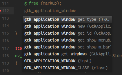
Thank you.
Can you increase max width of completion window ?. It’s useful for long line items (eg Gtk+ function).


Thank you.
Can you increase max width of completion window ?. It’s useful for long line items (eg Gtk+ function).

I saw this line
in the changelog and thought you might have fixed this bug I reported a couple of days ago.
but I still have this bug!
The COOPERATE_WITH_AUTO_COMPLETE addition could be great but what are the ways in which plugins can make the autocomplete work with the tooltip? Here are some use scenarios but I don’t think it’s possible to implement them.
Popups are scollable \o/ And the auto complete popup a well.
sublime.COOPERATE_WITH_AUTO_COMPLETE has an interesting side effect where the popup is not closed anymore when text is entered but when the selection is changed through something other than text input or right/left delete, for example by moving left/right or creating a selection. I don’t have any issues with that in particular, just mentioning.
It’s also displayed on the left of the auto complete popup by default and will move to the right if the popup is would exceed window boundaries otherwise. The traditional way in other editors is to show on the right by default. Just personal preference? I could also see a solution where the popup would go above or below the popup (above still being above the currently edited line), so how about making this an option?
@gregor.hoch: It should be possible to create a context key binding that only triggers when the auto complete popup is visible but I don’t think there is a way to get the currently selected item.
Now that tooltips scroll in windows, it is much more usable. Not to mention it looks like there were some tweaks to styling, so now when I try and simulate a border, I don’t get a giant border where the scrollbar is; much better and much more usable. I like it  .
.
I really like to know if supporting img tag is on your list. I was surprised that no one backed me on that in preview release topic since this single tag could enable us to create a lot of cool new features like:
@aziz, I am with you with image stuff. I guess the problem is linking to assets in zipped packages. Maybe if images were base64 it would be easier. I think images would allow you create things like buttons and such which would be cool. I would also love tables. Tables would be cool. I guess if you probed me enough, I would probably ask for all of the HTML stuff  .
.
I totally understand why Jon does not want to add all the HTML syntax, rendering and layout is really hard. It’s absolutely a wise decision to keep it simple. All I’m saying is that supporting img should be easy and gains are huge.
I would love to see tables and lists as well but they might introduce a lot of complexity for rendering and layout while img should be fairly simple and should not add that much overhead.
Use-cases I had in mind does not involve loading images from packages, but loading images that are mainly generated on the fly (e.g previewing a Latex formula, a markdown image in a document, or a graphVis graph in dot files)
Yes, I agree about img. Didn’t think about these applications before… 
Also understand that Jon is not going to add all html tags. It would be good to know about his plans though so we don’t spent time implementing work arounds.
For the other things, maybe the community can come up with functions that format lists, tables, code (pre tag) etc. in a useful way.
Maybe support could be added for the embedded format recognized by Chrome and Firefox. For example, paste the URI found here into either browser and you should get the base64 encoded PNG.
I completely understand why some tags and CSS would be a pain to implement; I realize this isn’t all trivial stuff. I am okay with working around quite a bit of it. It will limit what can be done via tooltips, but people will adapt. I think if I had a list of things I would really like, it would be:
img
lists (CSS is so limited, it would be nice to just get actual lists as I am not to sure how easy to implement good lists would be with such limited CSS)
background-color
to work on inline elements, probably some other CSS stuff as well because CSS is very limited here, but I would have to think about what is most important.
I could maybe live without tables, but they would be nice, but I understand if this just wasn’t going to happen.
Another area that I’d like to see more development in 2015 is Folding and Wrapping:
Folding:
Right now folding is based on indentation which does not cut it most of the time.
Although users and plugins can manually fold a region of the text but it’s impossible to add a
fold-able region and get disclosure triangles in the gutter through syntax definition
(tmLanguage files) or tmProperties files.
Disclosure triangle and ... images used in folding should be customized based on the background
color of the color scheme. Just like what’s done in the default theme to change the color of tab close buttons (x) in the tab bar. AFAIK, it’s not possible at the moment.
It should be possible to add auto folds with no ... for things like converting function to f (MATHEMATICAL ITALIC SMALL F).
It’s a really nice feature in Emacs that I’d like to see in Sublime in future.
Wrapping:
*, - and > and indent the- a sample long list item in a markdown file
gets wrapped like this at the moment
while it should be smarter and wrap it like this:
- a sample long list item in a markdown file
  should get wrapped like this in future
With regards to COOPERATE_WITH_AUTO_COMPLETE, the intention is that the popup is displaying information relevant to text in the buffer, not to the selected item in the auto complete window. e.g.,
foo(arg1, arg2|)Auto complete would be showing completions for the current word, but the popup in this case could be displaying information about the parameters that foo accepts.
I’d like to provide a way for the AC popup to show extended information about the currently selected item, but it would work via a different mechanism than view.show_popup().
[quote=“aziz”]I saw this line
in the changelog and thought you might have fixed this bug I reported a couple of days ago.
but I still have this bug![/quote]
It’s a different issue, but I do have yours on the list of things to look at
[quote=“jps”]
lists (CSS is so limited, it would be nice to just get actual lists as I am not to sure how easy to implement good lists would be with such limited CSS)
background-color
to work on inline elements, probably some other CSS stuff as well because CSS is very limited here, but I would have to think about what is most important.
These are planned FWIW[/quote]
Really looking forward to the coming dev releases. Having inline elements with background colors will allow me to style the color picker plugin I’ve started the way I had envisioned it worked.
[quote=“jps”]
lists (CSS is so limited, it would be nice to just get actual lists as I am not to sure how easy to implement good lists would be with such limited CSS)
background-color
to work on inline elements, probably some other CSS stuff as well because CSS is very limited here, but I would have to think about what is most important.
These are planned FWIW[/quote]
Nice  .
.
Not sure if this is the right place to put it, but I have another feature request:
The Elastic Tabstops plugin currently adds spaces to align tabs, but it would be really neat if we could define real tabstops (rather than just tab widths) and to do this on a per-line basis. I understand that this might not be real high priority, though 
in the changelog and thought you might have fixed this bug I reported a couple of days ago.
but I still have this bug!
It’s a different issue, but I do have yours on the list of things to look at[/quote]
How about this major bug: github.com/SublimeTextIssues/Core/issues/571 ?
I mentioned it on your return post, but did not get any response.