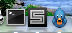
Please consider putting up a poll about the new icon. I agree with some of the people posting here that this is not “the one”.
The S is in a somewhat silly font that doesn’t feel substantial, or programmer-ish.
The glow around the S looks amateurish and/or old fashioned. They went overboard here.
There’s too much distracting visual detail around the 3D ‘platform’. Too much platform in the icon, not enough of the S-face.

 Luckily it’s easy to fix – just get a refund from Iconfactory and give the dough to Nate Beaty. His icon is distinctive and classy – you could totally build a brand around it.