Sublime Forum

Dev Build 2178

#1

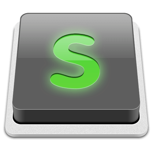
Dev Build 2178 is out now, with a long awaited new icon, done by The Iconfactory. Also in this build are a few misc tweaks, and several user-submitted vintage mode changes (thanks!).

I’m planning on turning this into a new beta soon, please let me know of any outstanding issues from this series of dev builds, especially in relation to auto indent.

0 Likes

#2

Squeeeeeeeeee ><

0 Likes

#3

Would love to see that in hi res :smile: Also, any other near miss contenders.

I like the isometric / button look but not sure about the S. Seems a bit out of place, being so soft and round amongst the hard edges of the slab.

0 Likes

#4

Renaming FTW!

0 Likes

#5

mag … mah

http://gmh.akalias.net/next-to-firefox.JPG

mag… ma

http://t3.gstatic.com/images?q=tbn:ANd9GcSWKvxGDSN8LtJdCPqRQOf6uDixHX7xYv6Si8pImZsMP2ei9GfSdw

mama… mama… mag…ma

0 Likes

#6

Loving the new icon, cheers!

0 Likes

#7

The new icon looks blurry at smaller image sizes:

https://img.skitch.com/20120215-gbw3a6d3uhg5f4pqn3rpwhy2t3.png

I think its the glow.

0 Likes

#8

I’m personally not a great fan of the icon, but just having one that’s easily distinguishable from Terminal is such a big bonus that it’s a welcome change :smile:

0 Likes

#9

https://p.twimg.com/Alrm_WpCAAAp1rZ.jpg:large

How do I make the orange green?

0 Likes

#10

like this:

Download from here: cl.ly/EErP

0 Likes

#11

Yeah but I’m so sorry, why orange or even green again? It feels whimsy.
Shouldn’t the icon maintain some continuity ? i.e. matte gray and darker gray

EDIT: May as well make the icon a preference as well.

0 Likes

#12

I’m not sure if i like the new Icon, here is why:

First: Why is the Icon a Button? I think the Icon should somehow describe the program, actually it does just add some confusion.

Second I would look for something more time-less. This Icon looks nice, because it leverages some design-trends from the last years. They are even today a bit cheesy already. (We call this hipster?) The old Icon wasn’t visually that great, but surely more time-less - thus a better icon than the new one. IMHO :smile:

Simon

0 Likes

#13

I actually quite like this icon, although the white bit looks a bit out of place? I don’t know. Either way it’s much better than the original IMHO.

0 Likes

#14

Regarding the icon: click :smile:

Guys, guys listen… rename finally works as expected!! Who cares about the icon? :mrgreen:

0 Likes

#15

The new icon is… aa… OK I guess.
I much prefer the other one.
The new one is not sublime, but rather ostentatious.

Would it be possible in the next build to have both so we can choose?

0 Likes

#16

[pre=#0C1021] v = self.window.find_open_file(old)
if v:
v.retarget(new)[/pre]
view.retarget > icon :smile:

0 Likes

#17

loving the new icon :smile:

0 Likes

#18

Hmm… I figured out what feels “off” about the new icon:

https://img.skitch.com/20120215-kdp1mqjfkurpkwbqwmwrbtuxct.png

The “S” reminds me a little bit of Comic Sans.

Sublime Edit is way to awesome to draw this comparison.

0 Likes

#19

Haha.

0 Likes

#20

Nah that’s definitely not Comic Sans

0 Likes