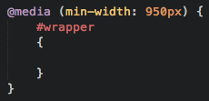
It looks like Sublime Text (both 2 and 3) have an issue highlighting CSS media queries if the query is not all on one line.
For example,
@media only screen and (min-device-width: 600px) and (max-device-width : 1024px) {
	div#desktop {
		display: none;
	}
}
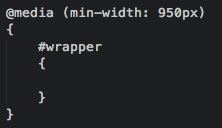
highlights just fine while the following does not:
@media only screen and (min-device-width: 600px)
 and (max-device-width : 1024px) {
	div#desktop {
		display: none;
	}
}