Sublime Forum

"Commits Column": Selected commit is not differentiated enough

#1

If this is a theme setting I can change, I can’t find it-

I would simply like the selected commit in the commits column to be brightly highlighted in the commit column itself.

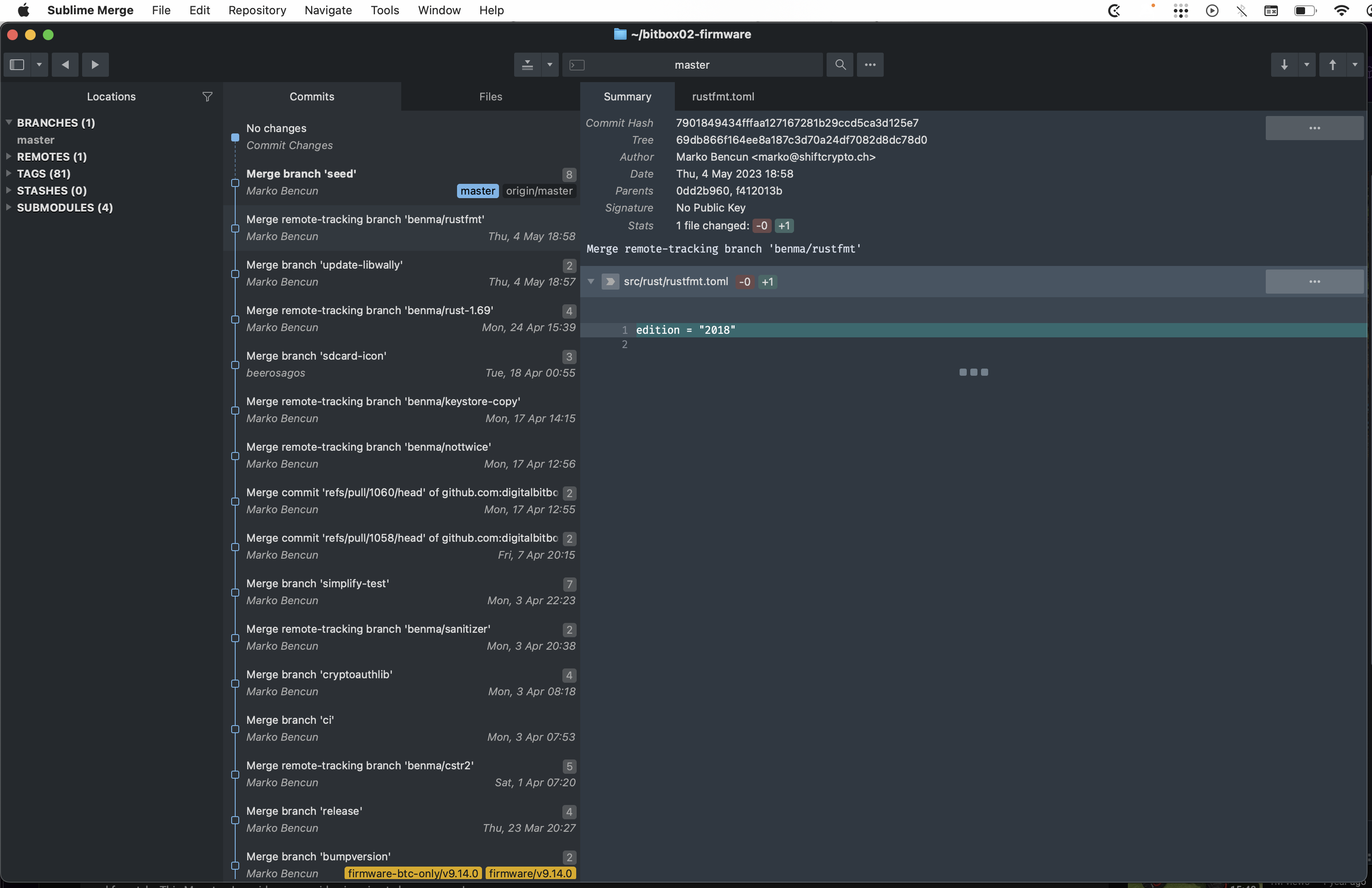
Take a look at the image- this shows the “selected commit”, a “non-selected commit”, and a “hovered-over commit” - as you can see, there’s just a slight tone change-

06%20AM

Any way to make this much more obvious?

Cheers!

0 Likes

#2

In the default dark theme selected commits are brighter. Are you using a custom theme or have you perhaps modified the built-in one?

0 Likes

#3

The screenshot is actually showing a different theme I was trying to fix the issue- but historically I have been using the built-in dark theme. I’m on MacOS Ventura if it matters- and it seems not controlled by any system-level coloring. (I’ve changed those around trying to fix this too). Same behavior on 2 different machines… I can’t be the only one who can’t deal with this?

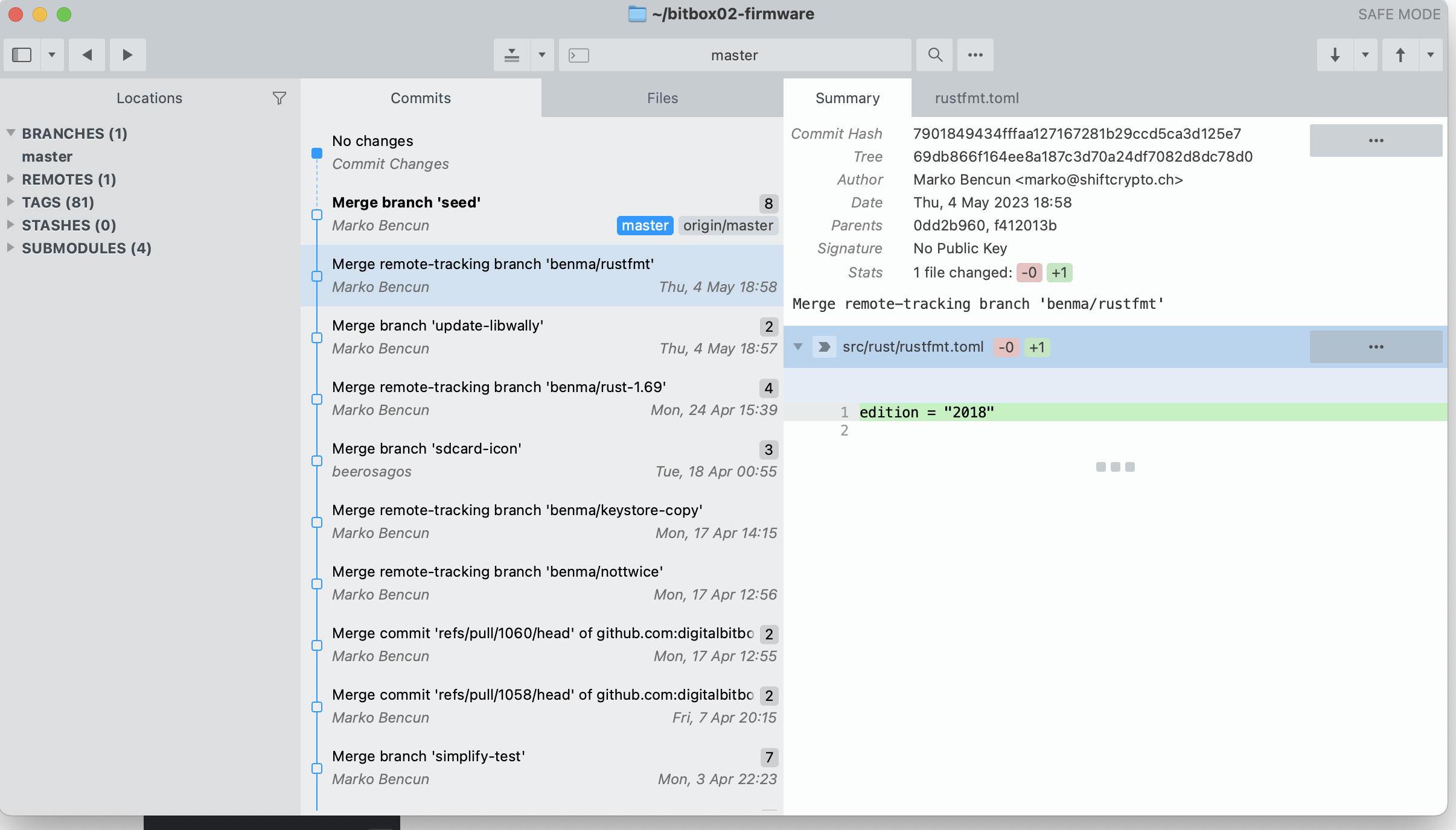
Here’s a shot from the other machine with the default dark theme:

0 Likes

#4

This is what it looks like on my end:

image

Does it happen in safe mode (hold down the Option key when starting Sublime Merge, or run smerge --safe-mode)?

0 Likes

#5

Yeah- that’s as bad as mine- how can I change that???

In safe mode without changing the theme, the selected commit has a nice easy-to-see blue background:
(but I’d like to use a dark theme)

0 Likes

#6

Only way to change it is to customize the theme, see https://www.sublimemerge.com/docs/themes

0 Likes

#7

Yes I figured that, and can certainly manage that, but I can’t seem to figure out which element it is.

0 Likes

#8

Setting "log_control_tree": true under Preferences > Edit Settings… lets you ctrl+alt+mouse1 click on any element and the tree of controls will be logged in the console (Tools > Show Console).

0 Likes

#9
control tree at: 451.086,171.257
title_bar [file_medium_dark, panel_visible] pos: 0,0 size: 1532,964
    .bg=[41, 45, 62, 255]
    .fg=[166, 172, 205, 255]
    .style=dark
 control pos: 0,28 size: 1532,936
  control [file_medium_dark] pos: 0,60 size: 1532,904
  control [file_medium_dark] pos: 0,60 size: 1532,904
   control pos: 0,60 size: 1532,904
    control pos: 0,60 size: 1532,904
     console_and_columns pos: 0,99 size: 1532,865
      split_container pos: 0,99 size: 1532,865
       control pos: 0,99 size: 1532,665
        control pos: 250,99 size: 400,665
         side_bar_container with_graph pos: 250,99 size: 400,665
             .layer0.opacity=1
             .layer0.tint=[45, 49, 68, 255]
          linear_container_control pos: 250,99 size: 400,665
           tab_body_container pos: 250,131 size: 400,633
               .content_margin=[0, 4, 0, 4]
            themed_container_control pos: 250,135 size: 400,625
             control pos: 250,135 size: 400,625
              commit_table_container pos: 250,135 size: 400,625
               scroll_area_control [scrollable] pos: 250,135 size: 400,625
                   .overlay=true
                   .top_shadow=[0, 0, 0, 77]
                   .top_shadow_size=8
                control pos: 250,135 size: 400,625
                 commit_table pos: 250,135 size: 417.5,2805
                     .dark_content=true
                     .row_padding=[0, 0, 0, 0]
                  commit_table_row [selected] pos: 250,135 size: 400,51
                   commit_summary_control index pos: 250,135 size: 400,51
                       .content_margin=[8, 8, 4, 8]
                       .layer0.opacity=1
                       .layer0.tint=[49, 54, 74, 255]

Those bg and fg values look fine in RGB values (dark gray, and light gray), but something is overriding the actual values … maybe the tint?

0 Likes

#10
                  commit_table_row [selected] pos: 250,135 size: 400,51
                   commit_summary_control index pos: 250,135 size: 400,51
                       .content_margin=[8, 8, 4, 8]
                       .layer0.opacity=1
                       .layer0.tint=[49, 54, 74, 255]

This is the part you should be looking at.

0 Likes