i miss sublime, im in linux now… huhuhuhu! no wine for me thank you…
Color Schemes and Themes
I run Sublime using Crossover Pro (on Debian) and it works perfectly. Should at least give it a try. 
Hey guys. I have been making this color scheme for the past couple of days and, now that I’m finished with it, I thought I’d share it with you.
It’s a combination of Monokai and one other color scheme, Brilliance Black. I’ve tweaked most of the settings so that each and every element is clearly visible, but it’s to my personal liking, so it probably won’t suit everyone. I present to you: Sublimey 
Hope you like it!
Hey, thanks for posting. Looks interesting though a bit distracting. When I first started looking for and messing with themes I came across one that had a pretty good idea behind the styling. It had a palette ranging from dark to light and the importance of the element being styled decided how bright or dark it would be styled as the eye is naturally drawn to things that are brighter.
You can find that theme at: http://wiki.macromates.com/Themes/UserSubmittedThemes. Scroll down to Dominion Day to get a look at it and the basic idea behind it.
Perhaps you could mess with your theme and make it a bit more usable, but if you’re happy with it that’s all that matters.
Feel free to post a link to download it and I’ll add it to the list :]
[quote=“Anomareh”]Hey, thanks for posting. Looks interesting though a bit distracting. When I first started looking for and messing with themes I came across one that had a pretty good idea behind the styling. It had a palette ranging from dark to light and the importance of the element being styled decided how bright or dark it would be styled as the eye is naturally drawn to things that are brighter.
You can find that theme at: http://wiki.macromates.com/Themes/UserSubmittedThemes. Scroll down to Dominion Day to get a look at it and the basic idea behind it.
Perhaps you could mess with your theme and make it a bit more usable, but if you’re happy with it that’s all that matters.
Feel free to post a link to download it and I’ll add it to the list :][/quote]
Yeah, now that I think about it, it IS really bright. I spent a lot of time just finding a way to colorize this bracket or this dot, that I totally forgot about usability. I just made it bright so it would stick out. I’ll work on it today and I’ll post the results.
EDIT: Here it is. I’ve made it a lot more subtle and it’s a lot easier on the eyes and not that distracting. I took a little from Twilight, which was my personal favorite before this one 
Anyhow, here’s the preview and I’ve attached the theme in a file.
Cheers!
Sublimey.rar (1.71 KB)
Just wanted to share my current setup 
Here’s what it looks like *(http://i.imgur.com/pKqId.png) (I’m using this plugin to hide the menubar)
The Theme was loosely based off of the Minimal theme by myel.
The Colorscheme is just a slight modification of Monokai to fit the theme.
I attached the file with the theme and color scheme!
Minimal.zip (161 KB)*
Thanks for posting that theme :] Added.
If you could come up with a quick name for it so it’s a bit easier to differentiate it from myel’s theme that’d be awesome.
That looks cool!
After the public version of Sublime Text X is available (this month, hopefully), I’d love to include some of these themes by default. While they would have to be redone for the new theme system in X, it is at least more flexible.
Hmm, how about we call it “Clean and Usable” or just “Clean”. What ever fits, im horrible with naming things =P
how exactly does the theming system works in X ? Can I create a separate theme, without touching the “Theme - Default” folder? How can I choose between those themes than?
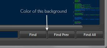
And how (the hell) can I finally change this color:

I thougth that it was the “background_color” value in here:
    {
        "id": "quick_panel",
        "class": "quick_panel",
        "row_padding": [2, 1],
        "background_color": [10, 10, 10, 255] // <---
    }
I think it worked once, but it doesn’t anymore…  This color is my nemesis in theming the X.
The current theme is not changeable from Default.sublime-theme in X yet, but I’m more than happy to make it so.
The background on the find etc panels is rendered using the “panel_control” class. The “quick_panel” class is only used by the Select Project functionality at the moment.
Aaaah, great. Thank you 
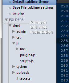
And, I have another question. Is there a way, how to remove the first indentation on a sidebar tree? Illustration:

There isn’t, but you can tweak the “indent” setting in the “sidebar_tree” class to reduce the horizontal indentation in general.
If you’ll have nothing else to do, could you implement it?  That first indent is useless, while forcing me to widen the sidebar (if I don’t want to see the horizontal scrollbar).
And, I hope last few questions 
]How to color the text of a sidebar item names, with different color for the selected one (so far, I’ve modified only a section title with the “sidebar_heading” class)/]
]How to set the permanent background to the sidebar section titles (FILES,FOLDERS title rows)/]
]Is there a way to add a shadow to the texts in sidebar, tabs, buttons, etc.? That would enable me to use a lot more details in UI design/]
Or better, is there any documentation, tutorial, or at least some logic behind which properties can I declare to which classes?
And what is the logic behind:
"layer0.inner_margin": [x, x, x, x]I’m using it, it works, but I’m not sure what exactly am I doing 
Update:
For illustration of what I’m exactly trying to do:
And here is the actual state I’m in right now - only the sidebar is left.
I don’t know if you figured out already, but try adding this to the default theme file:
{
        "id": "sidebar_label",
        "class": "sidebar_label",
        "color": [255, 255, 255, 255]
},
Gives me the correct colour for the files that are open, but I can’t seem to figure out how to get it to look better for the unopened files.
At least it’s one step on the way.
Has anyone found a way to change the color of items under the folders heading? Really enjoying V2 but would love to have my sidepanel fit with my theme =)
Alright. It doesn’t look like the file text color is editable just yet 
Anyway, here is what I have come up with for my Sublime v2 *(http://i.imgur.com/6raCM.png)
Really really enjoying all of the new features!
If anyone is interested I can post the config files and all that jazz*
