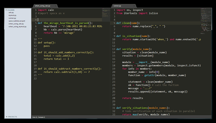
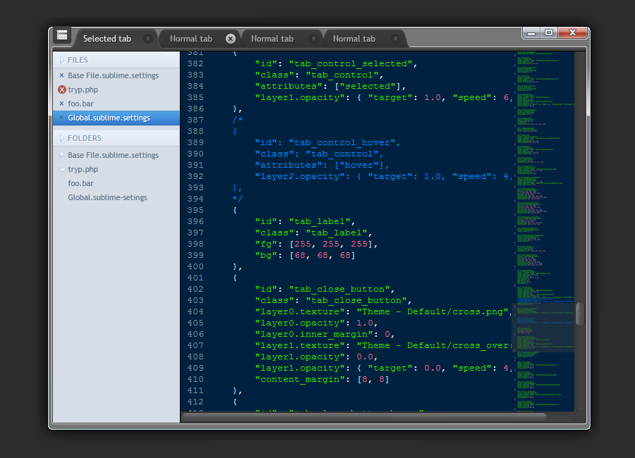
Just dreaming of an even cleaner sublime window layout.
Chrome-less sublime?
That looks sweet!
Without a title bar, there would need to be some other way to move the window, as well as minimise/maximise/close it
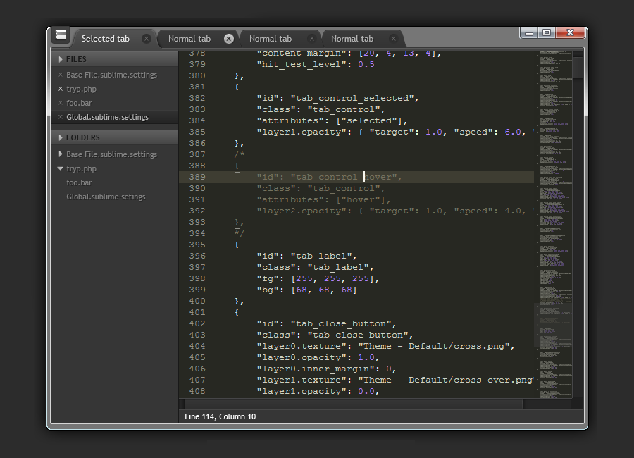
Just a mock up. No way how to do that right now. Here is the more complete version with my dark theme. Also note that in window mode, tabs would have to be offset from top by 10-15 px so the window could be draggable.
That would be awesome to get rid of the title bar in favor of a google chrome like interface with tabs in the title bar area. Love the mockup.
Thanks Jon, nice to hear you like it!
Darsain I like did with the top of the window and tabs. In fact that menu button at top left is perfect for windows/linux, and on mac that space can be used by the window controls and just keep the standard top screen bar. I’m also in favor of a chrome style window top. My only request would be to do something that feels less heavy in the windows/linux version of chrome and more like the mac version.
Here were my thoughts when I was doing that original mockup:
-
I put the project at bottom of folder pane to give some indication of what the current project is.
-
I moved the top of left pane down to align with the top of documents. It just feels visually crowded to have the pane aligned with top of tabs.
-
I removed the window groups from left pane, because with tabs they are not necessary. I would say that there are cases where the window groups in left folder pane are a good thing like on small laptop screens, so please don’t remove. For myself I can see using one or the other, but never both at same time.
-
I removed the vertical and horizontal scroll bars, because with the mini-map they are not really needed. Again, I can see cases where I might want regular scroll bars as well, but never scroll bars and mini-map at same time, it’s duplicate information/functionality.
-
I’ve noticed that the mini map blocks out the entire window vertically below where it ends. Perhaps it could only extend as far as necessary, or perhaps it can be made translucent? Just a thought.
-
One other tip others might be interested in. I have never been a fan of how wide the window borders are in vista/win7, they are just too wide, so I reset my window border padding to 0, and quite like it. http://www.howtogeek.com/howto/windows-vista/trim-windows-vistas-bloated-window-borders/
[quote=“Darsain”]Just a mock up. No way how to do that right now. Here is the more complete version with my dark theme. Also note that in window mode, tabs would have to be offset from top by 10-15 px so the window could be draggable.
[attachment=0]st_win_ui.png[/attachment][/quote]
Love how the sidebar looks on this, hope there will be a way of implementing it in Sublime 2, as im on linux with a darker theme, the ‘maceqsue’ sidebar stands out a bit for me.
that reminds me of the original BeOs look. it’s great.
is there a way that the titlebar could still be there for moving, minimizing, maximizing, closing, etc. but it’s 100% transparent until you mouse over it and then it fades into opacity?
mikeb, that is a very nice mockup. things i particularly like about it:
- losing the menubar/titlebar (visual clutter)
- tabs are better contrast with the dark background
- project list is aligned with the bottom of the tab bar (visually pleasing, and leaves a nice region that could be used for dragging the window, popup menu, etc)
I must admit, Darsain’s second gfx looks so awesome. Minimal, clean, functional… Modern browser style, Im buying it! :>
That looks awesome!!! I think that would be an awesome layout for the tabs.
I’m a linux user and I think it would work well there too. Possibly with a “Full Screen” option too, to hide taskbars.
Here postimg.org/image/py9ar2tvt/ is an actual screenshot (not a mockup) of my Sublime window without any Windows chrome. It also shows a bit of my bluish desktop wallpaper to make it more obvious. I used WinExplorer [1] to remove the border and the window title bar. Alternatively, an AutoHotkey [2] script could also be used. More info here [3].
The Window can be resized and moved around by using AltDrag [4], which I would highly recommend in general.
Have fun,
Markus
[1] nirsoft.net/utils/winexp.html
[2] ahkscript.org/
[3] autohotkey.com/board/topic/7 … ntry650488
[4] stefansundin.github.io/altdrag/
Wow a post from long, long ago! In the original mockup image, I believe it was Consolas on windows, but not sure.


