I want to customize the theme, but I don’t know what the API is?
{
        "class": "????",
 }
You’ll need to add a disclosure_button_control rule and create a texture with more (or less) space on the right-hand side of the arrow - see https://www.sublimetext.com/docs/3/themes.html#elements-side_bar for info about supported properties.
You can use the View Package File command in the command palette to open the “Theme - Default/Default.sublime-theme” file to see the existing rules.
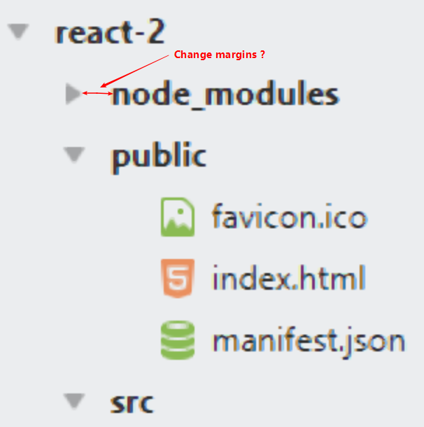
Thanks for your reply, I have tried the “disclosure_button_control” API before, and its performance is different from what I imagined.
An array of four integers – the values are applied, in order, to the left, top, right and bottom
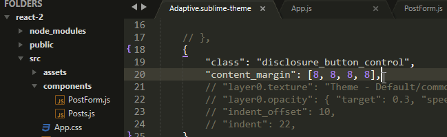
You’ll need to read the docs about how textures and icons work in Sublime’s theme engine. The content_margin for an icon defines the dimensions, so you are just stretching the texture (png).
You’ll need to create a new png and change the content_margin to fit.
I don’t normally do anything theme related because I have no design sense whatsoever, so here is an example based on what Will mentioned to play around with until someone that knows more about themeing comes along to offer better (more correct) help. This is based on the Adaptive theme because that’s what you were using in your image above.
As mentioned above, for icons the content_margin property changes the size of the image as it’s rendered, so in order to increase that value you also need to increase the physical size of the image that’s being used.
To do that, I went to the installation folder of Sublime Text (where the binary is), looked in the Packages folder for Theme - Default.sublime-package and copied it to my desktop, where I renamed it to have a zip extension. I then went inside and copied the following files out of the archive and into my User package, keeping the same folder structure as in the zip file (the open_file_close images are optional; the reason that they’re here is explained below):
User/
└── common
    └── dark
        ├── disclosure_expanded.png
        ├── disclosure_expanded@2x.png
        ├── disclosure_expanded@3x.png
        ├── disclosure_unexpanded.png
        ├── disclosure_unexpanded@2x.png
        ├── disclosure_unexpanded@3x.png
        ├── open_file_close.png
        ├── open_file_close@2x.png
        └── open_file_close@3x.png
I opened them all in my graphics editing software and doubled the width of every image, making sure that the original content was on the left hand side of the new image. For example:
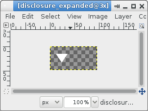
The rest of this post assumes that since the width of the physical images doubled, everything that used to think the width was 8 should now think that it’s 16 instead. This provides a pretty big margin, so you probably want to play around with the image sizes and such in order to get the padding that looks best for you.
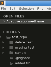
To start with, here’s what my side bar looks like with no customizations in place at all (i.e. just the default Adaptive theme):
Next, I created an Adaptive.sublime-theme file in my User package with the following content:
[
    {
        "class": "disclosure_button_control",
        "layer0.texture": "User/common/dark/disclosure_unexpanded.png",
        "layer0.opacity": { "target": 0.3, "speed": 4.0, "interpolation": "smoothstep" },
        "content_margin": [16, 8] // Width increased from 8 to 16
    },
    {
        "class": "disclosure_button_control",
        "parents": [{"class": "tree_row", "attributes": ["expanded"]}],
        "layer0.texture": "User/common/dark/disclosure_expanded.png",
    },
]
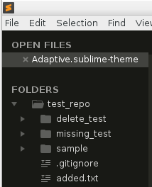
These override the rules for the disclosure arrows to use the newly modified files added to the User package instead of the default files, and the content margin for the first one has the width doubled from 8 to 16. Once the file is saved, the side bar looks like this:
Padding is in place now, but the disclosure arrow is way over to the left. To solve that problem, I added the following rule to the file to increase the indent offset of the sidebar tree. The value used here is the value that used to be set (13) increased by the width of the image (16).
    {
        "class": "sidebar_tree",
        "indent_offset": 29
    },
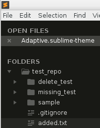
That gives something that looks like this; the disclosure arrow is back where it started, and there is some extra padding to the right between the folder and the arrow.
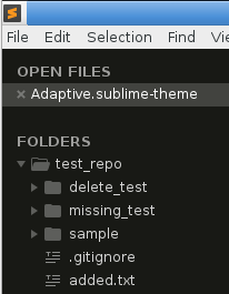
As a last step, notice that the Open Files content also got indented as a result of doing this. I don’t mind that myself (I don’t have this part of the side bar turned on in actual use anyway). I’m not sure what the correct course of action would be to try and fix that if it’s not desired.
As someone that likes visual consistency, one thing you can do is modify the open_file_close image the same as the disclosure arrow images and then add in a rule similar to the one above to change the size:
    {
        "class": "close_button",
        "layer0.texture": "User/common/dark/open_file_close.png",
        "layer0.opacity": { "target": 0.3, "speed": 4.0, "interpolation": "smoothstep" },
        "content_margin": [16, 8],
    }
That would make the close button be as far away from the file name as the disclosure arrow is from the folder:
Undoubtedly there is a better way to pull that off, or you could keep a bit of the indent but make the close button closer, etc.
I was mildly confused myself as to why changing the image size moved the image to the left the way it did (thus requiring this indent tweak at all) but since this reminds me of CSS and CSS has always perplexed me with why things never seem to line up or work as one would expect, I rolled with it.
In any case, it’s something to play with.