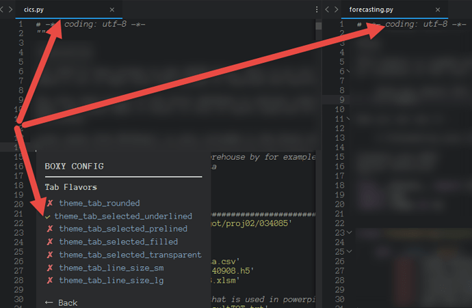
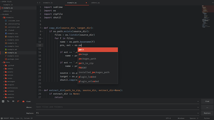
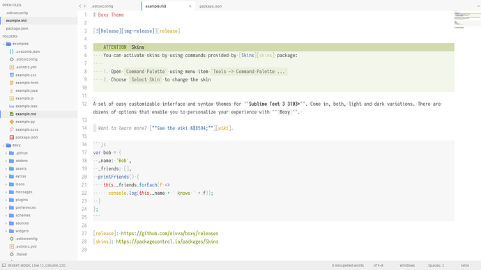
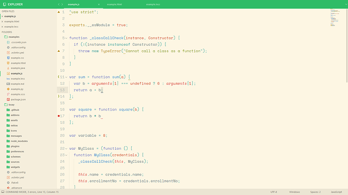
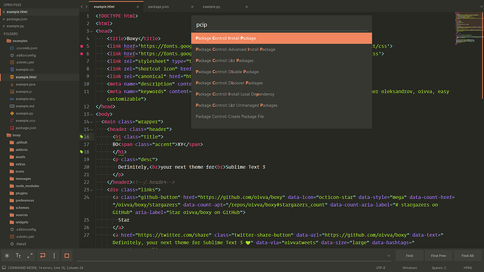
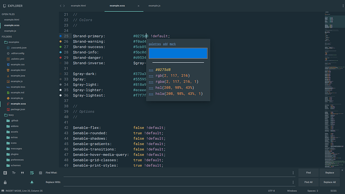
Thank you! I am using green accent and that’s why I thought indent guide color was affected by it 
Boxy – It Was the Most Hackable Theme for Sublime Text 3
I like this theme very much!! Thank you for your work.
One question: do you think you can add an option to have a smaller Search panel? Even if I set the global theme to “xs”, the search/replace panel is too big for my taste… 
Thanks again.
I am having an issue with the Tab flavour theme_tab_selected_…
It seems all tabs gets marked as selected? Any ideas?
- Boxy Theme: 3.4.0
- Sublime Text: 3120
- Platform: windows
- Package Control: True
- Dependencies:
- mdpopups: 1.10.0
- markdown: 2.6.6
- pygments: 2.1a0
- jinja2: 2.8
Here are a cutout of my settings, but I have tried fiddling with them without success
"bold_folder_labels": true,
"caption": "1. Full - 2. 2 columns",
"caret_style": "solid",
"color_inactive_tabs": false,
"color_scheme": "Packages/Boxy Theme/schemes/Boxy Tomorrow.tmTheme",
"command": "set_layout",
"copy_with_empty_selection": false,
"detect_indentation": false,
"draw_minimap_border": true,
"enable_telemetry": false,
"ensure_newline_at_eof_on_save": true,
"fade_fold_buttons": false,
"font_face": "Anonymous Pro",
"font_size": 11,
"highlight_line": true,
"highlight_modified_tabs": true,
"ignored_packages":
[
    "Markdown",
    "RestructuredText",
    "Vintage"
],
"indent_guide_options":
[
    "draw_active",
    "draw_normal"
],
"indent_to_bracket": true,
"line_padding_bottom": 0,
"line_padding_top": 0,
"preview_on_click": false,
"rulers":
[
    79
],
"shift_tab_unindent": true,
"soda_folder_icons": false,
"status_bar_brighter": false,
"theme": "Boxy Tomorrow.sublime-theme",
"theme_dirty_accent_orange": true,
"theme_find_panel_font_xs": true,
"theme_find_panel_materialized": true,
"theme_find_panel_size_xs": true,
"theme_tab_selected_underlined": true,
"translate_tabs_to_spaces": true,
"trim_trailing_white_space_on_save": true,
"wrap_width": 80
}
 Boxy v3.5.0
 Themes
 Add a very large tab variant
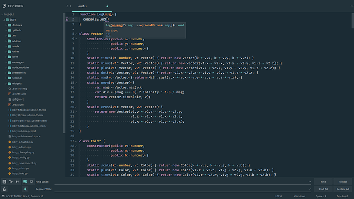
 Add a very small variant of the find panel
 Add monochrome accent
 Add semi overlayed scrollbars
 Add unified mode
Options
// Set monochrome accent color
"theme_accent_mono": true,
// Enable the same background color for UI components
"theme_unified": true,
// Increase size of tabs to extra extra large
"theme_tab_size_xxl": true,
// Reduce size of the find panel to extra extra small
"theme_find_panel_size_xxs": false,
// Enable semi overlayed scrollbars
// Works only with "overlay_scroll_bars": "disabled"
"theme_scrollbar_semi_overlayed": true,
 Color Schemes
 Add Bracket Highlighter support
 Add TypeScript popup styles
 In Action
Boxy Theme Addon - Widget Font <SIZE> addons were removed.
Now you can change console & find panel font size via Boxy Theme Addon - Widget Font Size.
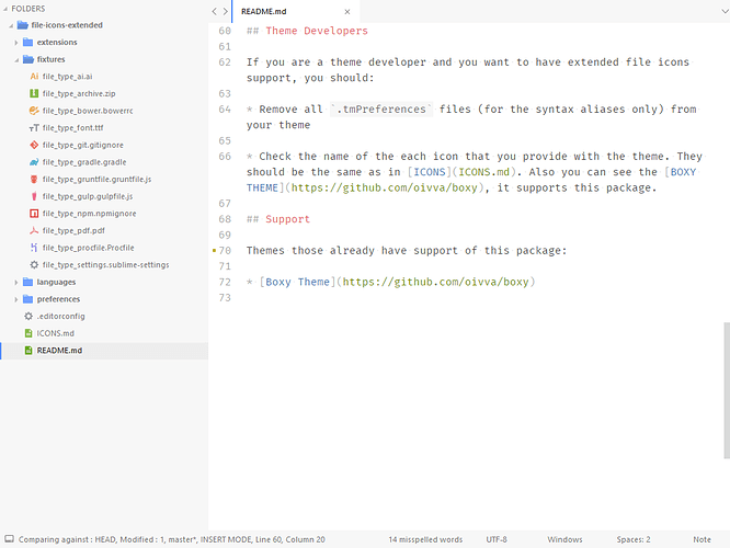
Also starting from now you can install File Icons Extended package which adds syntax aliases & icons for such file types as Git, Gulpfile, Bower & etc. Icon requests are welcome 
Awesome theme, amazing effort put to this. Thanks.
Do you have any release plan for new features? I’ve seen you have many commits on the dev branch and they seem like wonderful fixes and additions. Any news on where are we seeing them live?
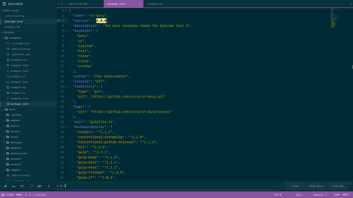
 Boxy v4.0.0
Starting 4.0.0 Presets command is replaced by Skins package.
Check it out: https://packagecontrol.io/packages/Skins
 Themes
 Fix activation of the extras
 Fix addon unloading
 Fix behavior when
 dirty accent not working
 Disable tab set line for mono accent
 Reduce scrollbar padding
 Fix tab height when
 theme_tabset_line_visible
 Fix tab set line conflict with
 theme_bar_margin opts
 Add
Add Skins support
 Add gear icon for *.ini syntax
 Add new and review existing skins
 Add numix accent
 Add option for quick panel border
 Add option to always use accent color for the dirty state
 Add overlined variant of the tabs
 Add solarized dark theme
 Add solarized light theme
 Add tab set line option
 Color Schemes
 Add solarized dark color scheme
 Add solarized light color scheme
 In Action
 Thanks To
Thanks for the credit above, and the one in messages/4.0.0.txt.
The update looks good, the preset migration to skins was an excellent idea, it works well.
The idea to migrate to Skins package is provided by @Equinusocio, thanks him for that  The current implementation is just a little bit dirty, but works even better.
BTW I forgot to say thanks for bringing the AngularJS GIT commit guidelines to my attention. They are excellent and I’ll be using them for all my projects in future.
@oivva I think you should use my Material Theme default scheme (instead of Ocean) since you add my theme as skin. 
I think that adding a clone of my Material Theme into your theme isn’t either a good ad politically correct idea 
Oh, no, I should not do that) I think that Material Theme is the choice of those users who want amazing ST look out of the box, that’s why it’s so popular. Boxy Theme is the choice of those users who need hackability and have very specific tastes. Skins are just the example how they can customize it.
The Material Theme skin looks exactly to my Material Theme, that is a different theme from your Boxy. It uses exactly the same UI color scheme, but not the code color and doesn’t follow the original Material Theme specs. I think it can trick users that, perhaps, think that Material Theme is only a skin of Boxy, i think you should specify that this skin is a replica of the original theme and give a credit, maybe in the description
Oh, I understand, I’ll add a credit in the readme. Previously I added it to the wiki, but it seems not many users take a look at it.
Done. I’ve added link to the original under the skin section. Also I’ve added reference link in README.md.

