Sublime Forum

Bootstrap for minihtml

#1

minihtml is a great addition to Sublime’s development tool-chain. But I’ve started to notice a worrying trend caused by it.

Due to limited feature set available and flexibility of HTML, developers use it in their own way/style and that eventually leads to a very inconsistent and incoherent UIs and UXs.

Atom, which uses HTML for all of its UI also noticed this pitfall and addressed it from the beginning by providing a style-guide (If you have Atom installed, bring up command palette and type ‘styleguide’).

I believe we should follow a simillar path. What we need is something like what “Bootstrap”
did for the web but for sublime’s minihtml.

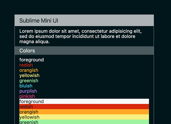
I’ve started to fix this on github but I need your help. hopefully SublimeHQ will take
care of this in near future.

6 Likes

What is MiniHTML?
#2

I like it. Note to anyone who tries it, it will crash Sublime if you don’t have the material icon font installed.

I’ve started to fix this on github but I need your help

What kind of help are you looking for? Is this directed at SublimeHQ? The community?

0 Likes

#3

What kind of help are you looking for? Is this directed at SublimeHQ? The community?

Kinda both.

Note to anyone who tries it, it will crash Sublime if you don’t have the material icon font installed.

At the bottom of the readme I had a note about the Icons:

Challenges

Icons

Icons currently are implemented using material design icon font, which needs to be installed manually. We need a better solution.

The good thing about font icons is that they’re vector base and look sharp on every DPI and we can easily change their color using CSS. the problem is that it’s not possible to use them in minihtml unless they’re installed on the system.

Code Samples

How to syntax highlight some source code in html with the same color scheme as the view

Tabluar data

Most of the data we want to show need a tabular structure but table are not supported. what should be done about that?

0 Likes

#4

This is actually doable as I do it in mdpopups.

1 Like

#5

Probably want to use rem units for fonts as well. I noticed you were using px.

0 Likes

#6

With this said, it would be even better if this could be done natively via Sublime as I have to provide a syntax mapping.

0 Likes

#7

I’m not sure if we need tables. I think most things can be done without tables. It is easier to get complex formatting of tables in Atom because they get it for free by using a web browser for their editor. But in Sublime, everything has to get implemented manually. I wouldn’t be surprised if Sublime never implements tables (but never say never :slightly_smiling:). But I wouldn’t count on them.

0 Likes

#8

I understand that implementing the CSS table layout might be overkill. but we still need to align items in a column and for that we need at least display: inline-block, width and height

0 Likes

#9

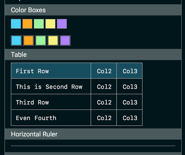
Manage to fake table, hr and color boxes with no images.

4 Likes

#10

The end result of the tables looks real nice, but they do look a bit cumbersome to actually code, but if you really need tables, it is a good workaround. I think once Sublime adds borders to elements, this could be more practical as you could literally just style the table, hr, and td tags etc. Also having to space stuff manually with nbsp doesn’t look fun either, but there may not be a way around that. I guess if you had something that could auto generate the table for you it wouldn’t be so bad.


I think defining the horizontal ruler this way is a bit overkill: <div class="hr"><div class="hr-inner"></div></div> Why not just style the hr tag? Keep it simple:

.bootstrap hr {
    display: block;
    padding: 1px;
    margin: 1rem;
}

I think it would be cool if for basic html things were kept pretty simple. So you could wrap your HTML content in a bootstrap div <div class="bootstrap"></div> and then get basic HTML styled with bootstrap opposed to having to apply a class to every element. Like maybe all H1 get the style of <div class="section">. Maybe that is just me. I get that you have to define classes for things like buttons and such, but it would be nice to get bootstrap styles just basic stuff just by doing something like this:

<div class="bootstrap">
<h1>My Header</h1>
<p>My content
<br>
More content
</p>
<hr>
</div>

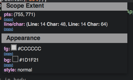
Color boxes also look nice, unfortunately until I have a workable solution for transparent backgrounds, I will probably just keep generating images, but if you don’t need to do transparent stuff, the color boxes look great. I think in some cases using something like this would be better. Like in ScopeHunter, I could see myself easily adopting this as I don’t think I ever display transparent backgrounds.


I guess when I’m looking at this, I’m looking at it as how can I apply it to what I am already using.

I might take your demo, and create a special mdpopups branch and apply kind of what I think would be cool as a separate example. As often I convert markdown to html, it would be nice to just wrap the basic html and get all this cool stuff. Turn admonitions into panels with icons. Translate top level H1 into section dividers. Style code and pre blocks with syntax highlighting etc. I think I will do a mock up tomorrow. Maybe I could even cobble together a table plugin for Python Markdown to spit things out as you are doing them.

Anyways, I really like the work you are doing here.

2 Likes

#11

Not sure about the capabilities of minihtml, but one of the following may be possible:

  • use downscaled PNG. I.e. need a 16x16 icon? Then use a 32x32 icon and down scale it via css; in real browsers this gets you a sharp image.
  • use data URIs for images or fonts

Btw, using svg over fonts is almost always a good idea though. Icon fonts are usually suffer various transformations (i.a. antialias) which make them less… sharp.

0 Likes

#12

Btw, using svg over fonts is almost always a good idea though. Icon fonts are usually suffer various transformations (i.a. antialias) which make them less… sharp.

SVG is not supported

use data URIs for images or fonts

web fonts are not supported

use downscaled PNG. I.e. need a 16x16 icon? Then use a 32x32 icon and down scale it via css; in real browsers this gets you a sharp image.

Then I can’t customize the color of the icon image which is very important.
Don’t forget, the background could be any color. all that we know is that it is light or dark. so we need to be able to set appripriate color for the icons.

2 Likes

#13

Feature Request: tinting images with a color like in sublime-theme

One solution for the icons, is to keep using images with data URIs but being able to tint the image with a color using CSS. something similar to what we have in sublme-themes

1 Like

#14

Again, even if Sublime doesn’t add a tint option it can be done pretty easily. I added an image tinter in mdpopups, so it can easily be done.

1 Like

#15

Experimenting with this with mdpopups: https://github.com/facelessuser/mdpopup_test.

I’ve found that for some reason Sublime gets very unstable with all of this minihtml stuff. I had to remove icons as things got really unstable when I was use the icon font. Maybe it’s just me.

0 Likes

#16

I’m also experiencing a lot of crashes. You think it’s because of the font icons? I’ll remove them cause they’re not feasible now.

0 Likes

#17

I think minihtml is having issues with the icon fonts. Removing them gives a lot more stability, but not perfect stability. I still get occasional crashes with them removed, but they are significantly less. I feel like we are stress testing minihtml by trying to use all the features :).

0 Likes

#18

I plan on narrowing down what the issue is, but I wanted to get a general version of your bootstrap stuff that worked with mdpopups better, so that is where spent my time today.

0 Likes

#19

New button colors and sizes and panel colors are nice. Just finished merging everything in to my mdpopups sandbox. I have to say, I think that is almost all the basic stuff you would need. I do tweak things a little in it. And I reformat the CSS so it can be applied to the HTML Python Markdown spits out, but it is fairly close to your original.

Tables I find are still a little wonky on occasions. Sublime will render some rows just slightly smaller even though you are using a mono-spaced font and have everything aligned, but it is fine workaround.

Things generally look nice with the style:

1 Like

#20

I tweaked some style one more time. make sure you have the latest CSS if you want to start tweaking them.

Tables I find are still a little wonky on occasions. Sublime will render some rows just slightly smaller even though you are using a mono-spaced font and have everything aligned.

I’ve also noticed them. for my font it renders fine on 13px and 16px. I thought it could be fixed using the settings "font_options": ["no-round"] but I was proven wrong. @jps metioned Sublime is not doing some rounding for sub pixel values, it has to be related to that.

0 Likes