The console and build / output are both text_output_control classes. Both use the color scheme set in the Widget.sublime-settings or Widget - .sublime-settings. If none is set, the global color scheme is used.
A theme can modify the background color with the color_scheme_tint attribute. An adaptive theme, which adapts its colors from the global color scheme might want to set two different tinting rules for dark and light color schemes.
The color_scheme_tint value needs to be adjusted to match the `panel_control``s background color.
Example
{
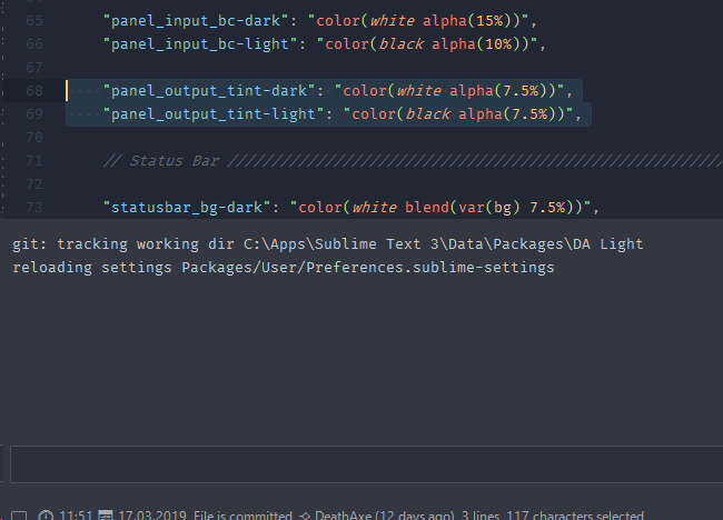
"variables": {
"panel_output_tint-dark": "color(white alpha(7.5%))",
"panel_output_tint-light": "color(black alpha(7.5%))",
},
"rules": [
{
"class": "text_output_control",
"color_scheme_tint": "var(panel_output_tint-dark)"
},
{
"class": "text_output_control",
"parents": [
{"class": "window", "attributes": ["file_light"]}
],
"color_scheme_tint": "var(panel_output_tint-light)"
},
]
}
Result
The margins are controlled via panel_control class or one of its subsequent classes
    // Panal Specific Margins

    {
      "class": "panel_control find_panel",
      "content_margin": [6, 12, 6, 11]
    },
    {
      "class": "panel_control replace_panel",
      "content_margin": [6, 12, 6, 11]
    },
    {
      "class": "panel_control find_in_files_panel",
      "content_margin": [6, 12, 12, 11]
    },
    {
      "class": "panel_control input_panel",
      "content_margin": 12
    },
    {
      "class": "panel_control output_panel",
      "content_margin": [0, 8]
    },
    {
      "class": "panel_control console_panel",
      "content_margin": 12
    },