I just updated to latest version (Sublime Text 3 (Build 3143)), and I found the new icon changed. I didn’t recognize that was Sublime at my first glance. The ‘S’ letter looks like an reverse ‘Z’, or a lightning mark, or the scar on Harry Potter’s forehead. It seems less recognizable than the old icon does. I strongly recommend to change the icon back. Thanks.
About New Icon
boxsnake
#1
0 Likes
Sublime is not Google Chrome! Help me restore my good old theme!
Restoring the good old (curved) icon
octothrope
#3
You can change the icon you see very very easily on a Mac, and I’m sure there are ways on other OSes as well. Here are some great ones to get you started: https://dribbble.com/tags/sublime_text
0 Likes
ETCAETERA
#4
Actually @boxsnake what you’re asking is kind of irrelevant, because it’s purely subjective don’t you think ? you can’t ask to revert back something unless it’s introduced a bug. What you’re asking is purely a matter of taste (+ you can easily change the icon instead)
To my taste I prefer that new icon. I’m on a Mac and it suits better. + I find it more modern the old one like a 3d shape is not bad but stand oldschool’ish to compare with the other one aside. I think Flat design rules these days and all 3d object as icon is not the way (like Cyberduck, etc…)… as everyone make flat design, if you consider the whole pictures on a system, it makes things more in harmony when there’s not someone seems to be part of an older OS system. I like customization but as it makes a machine slow I stick with all the orignal things from the OS except for OS options and wallpaper.
0 Likes
Jackeroo
#5
It is not so easy to change the icon in Windows. I changed it but in a round-about way.
It is not the old official icon but a close facsimile. I can say for a fact that Resource Hacker does not work.
0 Likes
ETCAETERA
#6
When I was on windows back in the days I customize my OS with Stardock softwares and it was very reliable to me so todays I check they are in the game and alive : https://www.stardock.com/products/iconpackager/
But Stardock Iconpackager is 10 bucks.
Instead you can customize a shortcut to the app easily :
Change Program Icons
Icons are usually modified so they seem presentable on your desktop. Desktop icons are easily changeable, as the ability is present by default on Windows 10. First, find the program whose icon you want to change. Right-click the program and select Create shortcut. Drag the shortcut to your desktop. Right-click the shortcut and select Properties. Your Properties window should open to the Shortcut tab. Click on the Change Icon button.
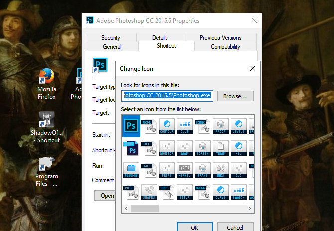
Find the ICO file you want to use. Once you’ve found your file, double-click it. In the following window, click OK. Then, Apply. If the switch does not work instantly, right-click your desktop and select Refresh.
I convert the PNG to an ICO file here :
0 Likes
Jackeroo
#7
Yes, that is how I did it. I will stick with the icon I have for now, but thanks for the information.
0 Likes
highbaser
#9
The new icon, as well as the new UI style, have just been hit by the great hammer of today’s designer dictatorship that Google, Facebook and some idealist scum of web designers keep forcing upon our eyesight. Everything needs to be made of nonsense origami-like shapes, without any good-looking or real-looking part.
In a nutshell: The new look is weak, real Sublime has curves and gradients.
0 Likes
deathaxe
#10
scum of web designers keep forcing upon our eyesight
Which leads us to a fundamental question: Why have all recently published 3rd party themes already gone that way? I guess no one forced that guys to make flat designs?! Nearly none of those new themes during the last months (and maybe years) came around with that bunch of overwhelming gradients and 3d effects. From this point of view and the fact that ST tries to focus on a minimal set of required UI to not distract from writing text, the new UI is just the next logical step in evolution.
But in the end this whole discussion has absolute no values as this is just a question of taste and (except the icon, maybe) everything can be modified to match your personal taste with just a couple of clicks. If gradients and 3d effects are really that sublime in the eyes of the community, more and more such themes will arise.
With hundreds of packages installed it doesn’t matter whether one more package with a custom theme is installed or not.
1 Like
highbaser
#11
If gradients and 3d effects are really that sublime in the eyes of the community, more and more such themes will arise.
I was talking about the default theme and the default icon which can’t be changed by installing a theme.
to focus on a minimal set of required UI to not distract from writing text
… for which the easiest way is not to change anything on a default UI that exists for a long time and people got used to it without problems. If ain’t broke, don’t fix it. Changing the UI results in distraction for everyone who used and liked it before. I had spent half an unproductive hour finding out how to switch back to the original theme.
0 Likes
deathaxe
#12
If ain’t broke, don’t fix it.
It was broken: Had no HIDPI support and therefore a complete rework of all assets was required!
I was talking about the default theme …
Me, too.
I had spent half an unproductive hour finding out how to switch back …
… and a couple of hours to complain about. Hell, it killed you.
0 Likes
highbaser
#13
HiDPI monitors are not for real developers but for visual orgasmists and you think it’s okay to ruin the user experience of the majority - including real developers - that don’t use HiDPI monitors. They could have introduced an optional HiDPI theme instead of making it default.
… and a couple of hours to complain about. Hell, it killed you.
… which I intentionally did not count because it was my choice to complain. But it wasn’t my choice to use the new theme. This is what innovation idealists should finally understand. And still, I can’t get rid of the new icon.
0 Likes
deathaxe
#14
Except your very personal opinion about HiDPI screens - which is not worth to discuss about - the simple question the authors had to answer was:
Hmm, we did a bunch of changes to the theme engine including support for any possible resolution. Now we need to create a theme, which supports all the new features, perfectly scales on any screen size and resolution, and which adapts itself to the color scheme a user selected. What todo?
- Just create new high resolution images for the existing theme - Many may blame as to be not innovative, and the current theme needs some cleanup anyway!
- Follow the major trend and create a new flatter theme from scratch which tries to use the best of the two worlds - The older conservative users will hate us for leaving the beloved cold dark wet cave with the fire place in the middle, they got used to sitting around for ages with their wooden cudgels.
From the point of a developers view none of the solutions is perfect. As there are way fare more important things to do creating 2 themes for both worlds was no option, I think. It’s just a question of resources.
Btw.: I don’t use HiDPI, too, but as there is a growing number of people who do, it must just work. Personal opinions don’t matter in that case.
0 Likes
highbaser
#15
The older conservative users will hate us for leaving the beloved cold dark wet cave with the fire place in the middle, they got used to sitting around for ages with their wooden cudgels.
The older conservative users will hate you if you make statements about their opinions like “not worth to discuss about”. The older conservative users will hate you if you override their will (their existing good old default theme) with your idealism (the new shitty default theme). The older conservative users make up the veteran part of your userbase. If they did not exist, Sublime would be just a toy of soulless ADHD idealists who call themselves innovators, instead of a good and valuable product. Take this into consideration.
Many may blame as to be not innovative, and the current theme needs some cleanup anyway!
Only innovation idealists will blame you for that - who can switch for new hi-DPI themes with a few clicks. You don’t need to be innovative anyways. Just keep it good and stable - this is what you need to do. Change is not innovation. At the same time, fine-tuning your design to the preference of designer dictator monkeys is also not an innovation.
From the point of a developers view none of the solutions is perfect.
If you could quit sharing a developer’s view for just ten seconds, common sense could easily solve this situation and add a third point to your list:
- All new installations should go with the new theme. All old (existing installations, that can be easily detected by detecting an existing config folder) should go with the old theme. “For those who have hi-DPI screens, please switch to the new theme” should go to the release announcement or release notes. AFAIK innovation idealists can read and follow this simple instruction (of course only if they haven’t forgotten to read as the Latin alphabet is thousand years old = obsolete
 ).
).
0 Likes
deathaxe
#16
Just to clearly state it: I am not involved in the development team in any way. I am just what you might call a “shitty innovation idealists” whose first personal adjustment was to change the theme, when I started to use ST3 about 2 years ago.
What I’ve posted here is just my very personal humble opinion which counts not more or less than yours. It may not be the developers opinion, so don’t blame them for what I wrote!
You may like it or not, but things change over the time. Some for good some for bad. Solid solutions like latin alphabet lasts a little longer others disappear if proven bad. This is what Darvin called evolution. 
If the GUI would change every half a year, I’d be absolutely with you. The heavy GUI changes with each major release of any of the mobile OSs is horrible to me, too. But ST’s GUI changed once with the release of 3.0 since ages and didn’t even change any functionality, so what!
If everybody would think like you, we’d still struggle around with 80x30 characters ASCII GUIs if we even had one.
If the functionality and usability would fundamentally change, I could understand your frustration.
0 Likes
highbaser
#17
You may like it or not, but things change over the time.
Nonsense stock phrase. If developers don’t change it (or change it the way I described), it won’t change, so this statement becomes useless. As it is anyways.
Darwin’s theories are only valid in a non-civilized environment. In every civilized or conscious environment (e.g. among humans) Darwin’s theories should not be applicable. The more they are true, the more we behave like animals. Humans should not behave like animals.
The heavy GUI changes with each major release of any of the mobile OSs is horrible to me, too. But ST’s GUI changed once with the release of 3.0 since ages and didn’t even change any functionality, so what!
Still you buy those mobile phones, right? Still pay money for them, thus giving a plus one vote with your money for their crappy policy, right? Or do you use an old 2G feature phone?
If everybody would think like you, we’d still struggle around with 80x30 characters ASCII GUIs if we even had one.
…which would be still good enough for most of the daily work that we do in our everyday lives - if the information is there - but this is not the point. Noone wanted 80x30 displays, I didn’t want them either. We were talking about unwanted changes in the first place. This is why it’s your logical fallacy is to come up with 80x30 displays because noone said sublime should be ported to ncurses or should look like Turbo Pascal from the '90s. I liked Sublime as it was, with its beautiful original design and it’s very far from your MS-DOS displays.
If the functionality and usability would fundamentally change, I could understand your frustration.
This is the subjective part. If I have to vomit when I see Sublime because of the material shit that was forced upon it, my usability changes. However, the point here is not fixing what’s not broken. And Sublime wasn’t broken on non-hi-DPI displays. Still developers “fixed” it, even on non-hi-DPI displays. This is the problem.
0 Likes
wbond
#18
This conversation is not productive, and I don’t think it benefits the community, so I’m locking it down.
6 Likes