Sublime Forum

A more configurable minimap

#1

I don’t know how it is for others, but for me, the minimap is more cool than useful. At least, I ddon’t use it as much as I think I could.

The first problem is it’s on the right side, and for obvious reasons, I tend to look mainly at the left side of the window. Being on the peripheral of my vision sort of puts it out of contention. (Like most monitors nowadays, mine is 16:10; at least it’s not 16:9, which is idiotic.) If I have to look at it rather than having it in line of sight, it means I don’t make use of it. Conversely, I don’t need the file tree in my line of sight; I only need to look at it when I go to open a file. Therefore, I’d prefer to switch position of the sidebar and minimap. Of course this makes scrolling the minimap a bit awkward, as it’s not customary to scroll from the left side, but you can’t have everything :smile:

The second drawback is it is too narrow. I use largish font, and the larger your font size the more the minimap shrinks. I guess this makes sense in term of preserving screen real estate, or there’s possibly a performance reason behind it, but it means that paradoxically the bigger you need your font to be, i.e., the worse your eyesight is, the narrower the minimap will be making it even less useful. My screen is 1650px wide and the minimap is ~100px wide.

Lastly, it is usually too zoomed out. Most files I edit are short ~ 200 lines or less., I’d prefer to have it more zoomed in most of the times to so I can see more, particularly search highlight.

I’d love to see the width and zoom level of the minimap be more configurable, like emacs’

emacswiki.org/emacs/MiniMap

They also have some interesting additional features like displaying function names in full. I don’t know how well it works in actuality …

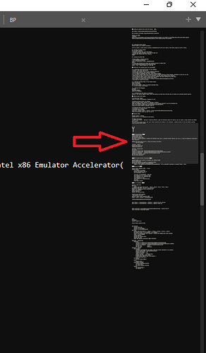
Attached is a screenshot of my minmap for comparison.

I realize many (or even most) people are perfectly happy with the minimap as is, and I think Jon mentioned before it’s a performance issue. But I think you can leave the defaults as they are, and let people change them with the caveat that performance may become unacceptable with anything other than the defaults. Machines are getting beefier all the time, so why impose a constraint based on a reasonable “average.”

0 Likes

#2

I agree - I do love the minimap, and it helps where I can see the blocks in my code - make navigation much easier. But I also do agree it could do with some love, and be a bit more customisable and allow for zooming levels.

0 Likes

#3

Hello,

@jps, can you take a look at this ? I got a matte screen macbook with a hiper resolution which is forcing me to increase font sizes and i noticed two things:

  • minimap font does not seem to be configurable
  • sidebar font size also can not be changed

Is there any api or theme config that we can use ?

Thank you !

0 Likes

#4

you can change the sidebar font size. In your .sublime-theme, look for “class”: “sidebar_label” and add “font.size”: nn

0 Likes

#5

I know this is a very old thread, but I came here to ask exactly the same thing as the OP.
Is this something I can do in the newer version of Sublime, or is there a package to help me with this?

Thank you in advance,
A.

0 Likes

#6

No, the minimap hasn’t been touched in a while except for a few options for the “currently visible section” and drag behavior.

0 Likes

#7

Sorry to revive an old thread but I share OP sublimated’s sentiments. My eyes aren’t too good so the minimap would be a lot more useful to me if it were bigger. With the largish font I use, I don’t have the screen real estate to use split view. Yet with single view, I have some empty space on the right where a bigger minimap would fit right in. As it is, I use the minimap as a giant scrollbar / quick jump.

I think the minimap size is kept to minimum by default for performance reason? It’d be great if it were configurable, with a disclaimer (“enlarge minimap at your own risk”, etc.

1 Like

#8

Adding my voice to say I would really like to resize the minimap to see my code blocks at a glance.

0 Likes

#9

I’'d second (or third’ed, nth’ed…) that - a way to have a custom zoom the same way that the normal panes work would make it actual useful, instead of just cool.

0 Likes

#10

This thread is quite old, but I’d like to add a me too! I have the same issues as sublimated. Currently I basically just use the minimap as a giant scroll bar since it is too small to really make out even a general outline of my code. I would love a resizable and relocatable minimap.

0 Likes

#11

I know that the subject is absurdly old, but if someone today finds it as I did, you can read my opinion about it, for me the minimap works as a bar to navigate in the file, and making use of letters large ASCII characters, I can comfortably go through all my code

This is a pretty clear example:

If you add some zoom functionality it would not be bad at all, in that if I agree with the OP

0 Likes

#12

How to customize the mini-map in Sublime Text?
When we hover cursor on the mini-map it shows where we’re on the page(by changing transparency level)!


I want that to be all the time there, So i can know where currently i am

0 Likes

#13

See the "always_show_minimap_viewport" setting.

2 Likes

#14

wow it worked thankyou !!

0 Likes