Sublime Forum

Support dark theme on Windows

#24

We don’t use WPF for Sublime products - just win32.

I’d be very happy having it look as advertised on https://www.sublimetext.com/ – dark grey titlebar. How do I do that? (I’m okay with having to toggle the menu bar to hide it, which I gather will still be in fugly grey-on-white.) Using build 3211 on Win10 (and Mac, where it’s not a problem).

The auto-dark plugin posted above does nothing but copy one preference to another. The thing it does not do is provide a color scheme file that makes the title bar dark, so changing the preference won’t get me anywhere.

Thanks

0 Likes

#25

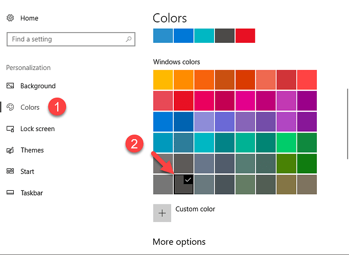
In the Win10 Settings App, go into the Colors preference and select or pick a color in the Colors section that’s what you want to use (here I used a default):

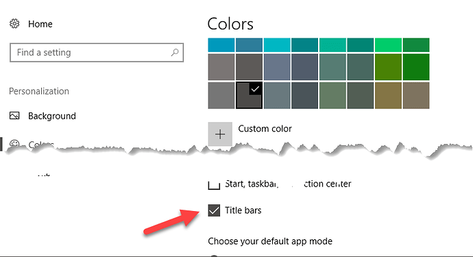
A little further down, there’s an option for where you’d like to apply it; make sure that Title Bars is checked:

Note however that this seems to only apply to the active window, and inactive windows still use the previous color; I’m not sure offhand if there’s a way around that. I looked briefly in the past but didn’t see anything specifically related to it.

2 Likes

#26

and inactive windows still use the previous color

You can customize the title bar color for inactive windows via the registry. Go to HKEY_CURRENT_USER\Software\Microsoft\Windows\DWM and create (or adjust) a DWORD value with name “AccentColorInactive”. Then set its hex-value to something like ff123456, where 123456 is the hex color value you want to use.

2 Likes

#27

Okay: I found more answers myself:

  1. Set the active title bar color by right clicking on the screen background > Personalization. Set your “accent color”. (Same thing @OdatNurd posted above – kudos.)
  2. Set the inactive title bar color by doing registry tomfoolery, or by downloading and running Ultimate Windows Tweaker. It’s like our old friend TweakUI for Win10. @jwortmann posted an easy registry hack above – I’d found this painful one that describes what is apparently going on behind the scenes.
  3. Now, the menu bar is still a white eyesore. Get rid of that by doing View > Hide menu. You can always get it back by hitting Alt. (I’ve also bound this to Ctrl+F1 so it’s like Office’s Ribbon toggle.)

This is what happens when you go away from Windows for a few years and work on Macs. You lose your mind unless stuff is all aesthetically pleasing.

2 Likes

#29

Now that Sublime Merge Build 2047 already has upgraded application title bar and context menu on Windows, are we going to see this update on Sublime Text?

0 Likes

#30
0 Likes

#31

Thank you. Nice to know that Sublime 4 is coming! But seems like it is still in early preview. I am looking forward to the Beta release!

0 Likes

#32

It’s been in discrete beta for a bit over a year now and is quite stable; if you have an ST3 license you can join the Discord and get access to it now. There’s a link in the pinned resource topic in the forum.

1 Like

#33

This has been a long ride… but Sublime Text 4 is already out and I updated today!
And it now has custom title bar just like Sublime Merge do.
Thank you all.

0 Likes

#34

Not to get too off-topic here, but whichever method Microsoft Edge uses to draw the top border has the unintended consequence of mis-matching a transparent top border with the other 3 sides. This is visible only when the Windows theme is set to “dark” while the app theme is “light.”

0 Likes