Sublime Forum

Style of Inline Errors

#1

In general, I enjoy coding in sublime. But there is a big issue:
I hope to get a hint how to change the behavior of these inline-errors. Currently, they look like:
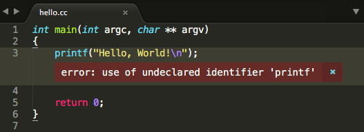
So they shift all the lines at another position, which is totally annoying.
To feel my pain: Write something in C++, make a mistake with templates (and use easy-clang). You’ll get a bunch of red bars all over the place. This might be ok for Christmas decoration but not for displaying information.

Is there any way (besides disabling this function) to not put them inline?In the language of CSS: make give them another z-index and do not “inline” them. While I do not like the entire Atom-universe, they do a better job at this point (displaying information):

If you look at the upper part of the screenshot, these errors, warnings are on top of the code and do not change any position.

So can I change them somehow in a top secret setting file?

2 Likes

#2

Not that I know of.

0 Likes

#3

No, the current implementation of inline errors is to use Sublime Text phantoms - which allow small HTML documents to be injected between text (or lines of text) in the text buffer. Phantoms are by-design inline only. To display content overlaid over the editor contexts a popup would need to be used.

What the Atom screenshot is showing is a popup being displayed at the location of an error – I presume when the cursor is placed there or hovering there. Currently we don’t have an implementation of error popups on hover, although a package could implement such a feature.

0 Likes

#4

Thanks for both responses.

The usual way: After several weeks of figuring out how it works, one asks a question in the official forum. Then 5 minutes later, I download a new dev-build and see that this isn’t an issue anymore:

  • better inline code-completion style
  • warnings and errors do not shift the code line
  • no need for boxy-theme anymore (nice job with the adaptive theme!)
4 Likes

#5

They don’t? :thinking:

0 Likes

#6

Ok, they still do actually move the lines:

This should be really fixed in a general way. Also the LaTeXTools plugin uses the inline preview phantom and moves all the lines!

0 Likes

#7

As @wbond states, phantoms are designed to be displayed inline. The question whether to display such error messages by phantoms or hover popups is a question of plugin implementation but not an ST core issue. ST provides all required possibilities to highlight errors and display messages.

I’d prefer to add a region to underline a faulty piece of code and display the error message in a popup when hovering.

I like the approach of the LSP package. It displays a diagnostics output panel at the bottom of the window with a list of all issues reported by a language-server. The faulty code is underlined with an icon in the gutter, just like SublimeLinter does. Hovering the faulty text displays the error description.

This way the text is not moved around by injected phantoms, but you still can clearly and quickly see all issues.

0 Likes

#8

Why do you want to display anything inline? It is distracting if the content moves. Then phantoms are a very bad design choice.

0 Likes