Did a real quick port here github.com/facelessuser/ScopeHunter/tree/ST3. Report bugs if any. I don’t think I will be doing any other porting today. I have 3 big plugins to port coming up, but I might take a break.
ST3: ScopeHunter
Release 1.4.0
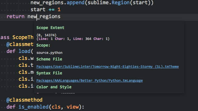
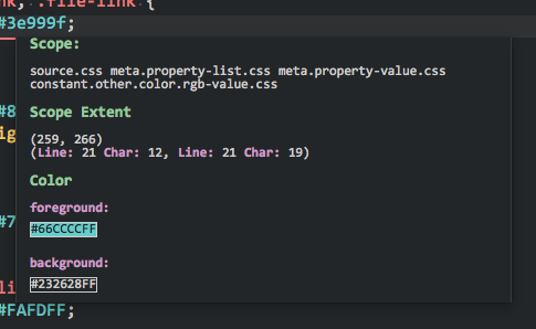
Sat down and played with the new tooltip API. I added an option to ScopeHunter in the latest release to show scope info in a tooltip. You can also click of the syntax file or color scheme file (that are currently loaded and contribute to your scope info) and they will be opened in a new view. There is also a link to copy all the info to the clipboard.
Also, the CSS style of the tooltip is completely configurable. Just code your own, drop it in the User folder and in the settings file point it at: User/my_custom.css, and it should use your CSS file. ScopeHunter currently comes with a stripped down default.css and a dark.css (shown below) and light.css.
This is experimental, so let me know if you find bugs. Keep in mind, Jon may change something in this API and break functionality as this is bleeding edge stuff.

Probably you should also a Textmate style scope hunter, that only show the scope name (maybe add an option for lite info?).
Lovely to see how many things pops up (see what i did here?) when a new API is launched.
Wait until the sidebar API is added! ![]()
Great and simple use case for the popup API. Played around with it a bit and left some issues on the tracker.
Really annoying that scroll wheel doesn’t work yet. Also, a
tag between multiple scopes would be nice, but it’s not supported currently and neither is the
border property.
Yeah, I wish hr was available too. I actually tried using it hoping, but sadly it was not supported.
Thanks for the issue creations. As it is still very experimental, I honestly didn’t test too much or implement everything I was planning on yet. Just wanted to get something out people could play with.
[quote=“iamntz”]Probably you should also a Textmate style scope hunter, that only show the scope name (maybe add an option for lite info?).
Lovely to see how many things pops up (see what i did here?) when a new API is launched.
Wait until the sidebar API is added! ![]() [/quote]
[/quote]
I think it can do just that. You can disable some of the info. Can’t remember how fine the control is. I will take a look.
I’m excited to see how other plugins start using the new tooltip API. Nice work with this one!
Just a suggestion, once this API gets released as part of the beta build, make the tooltip the default display style. Having the panel display as it previously did with “Instant Scoper” enabled causes some headaches when trying to use other panels(find). This is a big issue with the way sublime handles panels, and one I am currently dealing with in my plugin.
Yeah, I noticed the same thing while using it just for a few minutes. Would be nice if ST’s panel management got some updates, I’m all in for the custom panels that were proposed in the 3067 thread 
Windows fixes in Release 1.4.1. Get it when Package Control lets you. github.com/facelessuser/ScopeHu … /st3-1.4.1.
- Scheme and Syntax links working in tooltips on windows
- If loading a css with ‘\r’ chars, css will now work
More coming when I get a chance, just wanted to knock out the more critical oversights I had.
Release 1.4.2
github.com/facelessuser/ScopeHu … /st3-1.4.2
- Big feature here is auto selecting of dark or light css if you set “css_file” to null
; see default setting file for more info. The default dark and light css can be overridden in the settings file.
In the next release I will probably be trying to improve the look and feel. Maybe reformatting the tooltip info. CSS will probably change, and I will probably move to using classes. I am going to try and find a nice way to make it stand out if the scheme background color is too similar. I want to also display little boxes with the colors, but the CSS is pretty limited, so I am not sure if I am going to find a compromise yet that I am satisfied with.
It is possible that future Sublime versions will help fix some of the issues I am trying to overcome as this is a really new feature.
Anyways. Hopefully get the look in feel even better soon.
Before I find ScopeHunter, I used ScopeAlways.
And I tried ScopeHunter, it has a noticeable delay while ScopeAlways is real time.
If ScopeHunter can act more fast, it would be good!!
[quote=“jfcherng”]Before I find ScopeHunter, I used ScopeAlways.
And I tried ScopeHunter, it has a noticeable delay while ScopeAlways is real time.
If ScopeHunter can act more fast, it would be good!![/quote]
First, this is by design. Second, seriously, how fast are you reading scopes?
When I tap into something like on_modified and/or on_selection (which will literally run on every keypress and every cursor move), I make sure to check if multiple requests are coming in too fast (doing a lot of quick typing). That way, I can hold off on executing the payload until constant requests slow down or finish coming in (stop typing). Basically, I have given everyone a respectful plugin that won’t bog down when people are doing a lot of typing or holding down the arrow key for cursor navigation (python isn’t nearly as fast as native C). I personally think the current delay is fine and have felt no reason to tweak it.
Granted ScopeAlways does very little except post the scope in the status bar, so it isn’t going to impact performance much, nor will ScopeHunter if you turn off most of the other stuff, but it can also do much more as well. I wrote ScopeHunter first, and foremost, for myself. I’m not going to try and convince anyone to use my plugin, so if another plugin works better for you, please use that one instead. I personally like ScopeHunter and found it useful when writing language syntaxes and other various things, which is why I still support it  .
.
Release 1.4.3
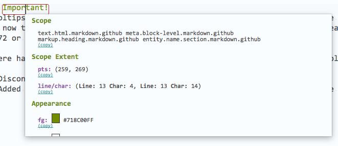
A lot of visual tweaks and re-formatting. CSS has been re-worked a bit, and now uses classes for a bit of the styling. Now that Jon added scrolling in Windows, it should be more usable there, but I have not yet tested Windows. As always, let me know if I broke something, or there is something you want to see. I have only a couple more things I am considering looking into. We’ll see if I get those out sometime soon.

Release 1.4.4
- Copy links to copy specific data from tooltips
- SubNotify plugin support for visual feedback messages
- Some reformatting of info

FYI, I am aware that the individual copy links in tooltips don’t work with multi-selection; I am working on it. I am wrapping up the rest of my planned features and fixes for the next release.
Release 1.4.5 github.com/facelessuser/ScopeHu … /st3-1.4.5:
- Fixed multi-select tooltip copy link issues
- Better scope extent detection
- Small formatting changes
Earlier it was asked if ScopeHunter can just display scopes, and the answer is yes. By default, scope is the only think enabled. All other advanced things must be enabled by the user. So here is just scopes.

I think we can call this done until Jon tweaks the API. Formatting may change a little if Jon adds new CSS and/or HTML capabilities, but functionality is complete unless anyone finds any more bugs.
Not works. Nothing happens when select either menu on Command Pallete
ST3 b3071, installed via Package Control
I tested the default tooltips still work:self.view.show_popup('Hello, <b>World!</b><br><a href="moo">Click Me</a> <style>color=red</style>', on_navigate=print)
My User Settings:{
"show_popup": true,
"show_statusbar": true,
}

 .
.