Sublime Forum

Problem with Anonymous Pro font

#1

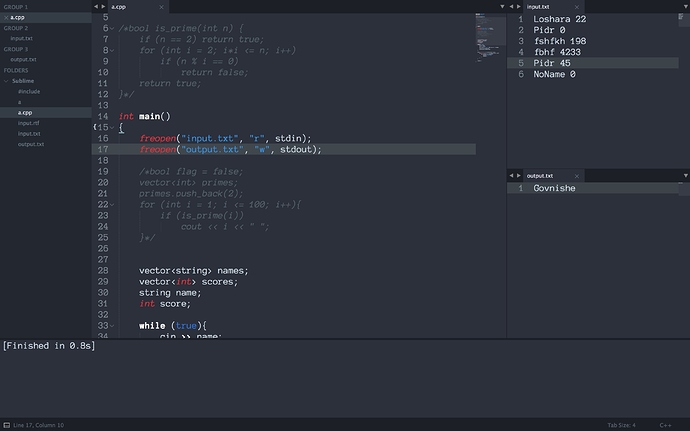
Well, it’s easier to show than to explain. For whatever reason my font looks like this and I haven’t been able to find a way around this problem yet. Changing font size didn’t help.


It looks like the left side of each symbol gets cut a little, especially noticeable on p’s. Any way to fix this?

0 Likes

#2

I see it looks like some clipping on font characters. I’ve noticed on other fonts as well distortions like this. I’m not sure exactly when I started seeing these kind of issues, but I know I’ve become more aware of them on my MacOS system recently. I’m not sure if there is a workaround either.

0 Likes

#3

Hmm, that could be due to some macOS limitations, as I’m using the macOS version of Sublime too.

0 Likes

#4

It’s been a small thing for me. Some times I get distortion in the opposite as well; instead of clipping it is stretched a little. I notice it, but I haven’t yet spent much time trying to figure out the why it occurs.

0 Likes

#5

It looks as if there’s not enough space for each symbol to be drawn in. Maybe there’s some way to edit per-symbol width, though a simple search in the preferences file didn’t yield much for me.

0 Likes

#6

I’m not really sure what the issue is as clipping isn’t always the issue. I’ve noticed that a particular character can render fine, and then in another instance not render fine. I think it is just some render problem with Sublime. But there is no width setting. Maybe there is a font setting that can fix it, but I haven’t played with them too much.

0 Likes

#7

It seems that the font sometimes runs into issues with clipping: https://forums.gentoo.org/viewtopic-p-6513818.html.

Which exact version of Anonymous Pro are you using?

0 Likes

#8

I believe the standard one, not the “minus” version (whatever “minus” stands for). I downloaded mine from here : http://www.marksimonson.com/fonts/view/anonymous-pro .

0 Likes