Sublime Forum

Keep sidebar "Open files" always visible / horizontal tabs feature

#1

To maximize editor space I like to hide Tabs, and instead use the “Open files” in the sidebar. The problem is that once you start working with the file tree, the opened files part of the sidebar is quickly out of sight due to scrolling.

I would like the opened files to remain visible, since it’s of great help when navigating between them. The basic idea es that it works like the normal tabs: the current opened file should always be visible, and the ones around them too. Maybe we can have some sort of separation from the file tree that can automatically span when there are a lot of opened files, maybe up to a maximum of half the screen or something like that before showing scrollbars.

Thanks!
Jose

4 Likes

Split the sidebar!
#2

http://docs.sublimetext.info/en/latest/file_management/file_navigation.html

0 Likes

#3

@rppn Thanks for replying, not sure what in that link is supposed to solve what I need. When I’m editing a group of files at the same time, I like to switch between them with Ctrl-Pgup/PgDn. Without seeing the open files list it’s just uncomfortable. With Tabs, you are seeing the file name so it’s intuitive, but as I explained before I like tabs disabled to maximize height size in the editor (you know, current monitors are landscape so there’s a lot of width but not so much height). I want open files to be visible when I’m switching them. I don’t want to switch the whole project with Go To Anything, which means typing more, I just need the open files :slight_smile:

0 Likes

#4

I was assuming, typing is faster for you.

Did you try running the command toggle_tabs via the keyboard with a key binding?

0 Likes

#5

What @jose.canciani is looking for isn’t currently possible in ST. You can not make the sidebar segment with the open files permanent, because it shares the space with the folder display.

0 Likes

#6

@rppn thanks for the suggestion! Toogle tabs means using tabs, which I don’t want, not only for the wasted height space I mentioned, but also because when you have several opened files, the name of the file get’s trimmed and it’s difficult to read.

What I need is that the Open Files section on the left sidebar works as horizontal tabs. @FichteFoll is right, once you use the folder tree, the open files go out of sight, which is what I use for quickly refreshing the map of files in my mind :slight_smile:

Jose

0 Likes

#7

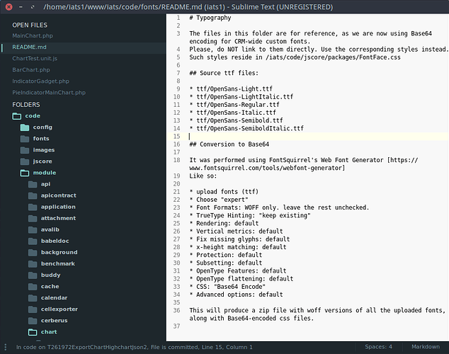
Here’s a screenshot of how I use it, you can see the OPEN FILES on top, currently highlighting the open file. I just want that to stick to the top and not scroll when navigating the tree.

1 Like

#8

I was thinking… instead of changing “open files” we can also consider “horizontal tabs” as a full feature.

The Open files list has other limitations: some plugins adds extra menu options to right click on tabs, but do not work for open files. So maybe a horizontal tabs feature is the best way to go.

If someone can change the subject of the thread, please do so, I’m not able to apparently. Thanks!

Jose

0 Likes

#9

The main issue with having Open File not scroll is when there are enough Open Files that they don’t fit in the sidebar. Then it isn’t possible to see all of the open files, nor the folder tree. Which then leads to multiple scroll areas, and having the complexity of managing a draggable divider between the Open Files and Folders and the wasted space between the two when there are only a few open files.

In short, I think the reason this hasn’t been implemented is because it is kind of messy, and has certain usability downsides, and feels less fluid than a single scroll area. I think generally Goto Files is the first-class way to jump to a file, and tabs and Open Files are just a way to visualize the open files when that is necessary.

0 Likes

Splitting panels - ie sidebar becoming top / bottom where top is opened-files and bottom is project file-tree
#10

thanks for the answer. I guess the open file box could adapt until it reaches the middle of the available height, and fix there. I don’t think adding scrollbars is confusing, if you have a long project you already have a scrollbar now.

Anyway, thanks again for taking the time to answer! Ctrl-p is nice, but the box covers most of the opened file. Maybe focusing open files when you start browsing using Ctrl+Up/Down? Once Ctrl is release, go back to where it was (only when tabs are hidden).

J

0 Likes

#11

Well, in that case, it seems like a good solution to provide an alternative position for the goto-file panel. Maybe a position which doesn’t overlay the previewed file.

1 Like

#12

I agree with this request, but I’d prefer the option to have fully panel splitting support along with additional docking features ( see my thread ) which would let you have the open files panel open above the file-tree and be able to control the height of both with a splitter-bar between them…

0 Likes

#13

I’d recommend linking to your thread to make it easier to find / know which one you are talking about

1 Like

#14

Linked… The issue with not being able to split panels causes many issues… For example, I can’t use the sidebar at all any more because trying to list open-files causes a major bug in ST3… By opening and closing files, a bug may appear which SHIFTS the array holding the text being output and the data behind it…

ie: Opening and closing files adds and subtracts entries. The project folder is below open files. Because the entries are being added and removed above, the project files start linking to different files… so something which linked from 1.lua text display to 1.lua file now links to 2.lua, 3.lua or 50.lua… there is a major bug in the system so there is no point using it.

Yes: Splitting panels into upper and lower may not solve the issue of poor coding - but it would provide many benefits to addons, etc… The bug still needs to be fixed, but being able to split panels would be a welcome addition because more information can be displayed - sometimes it can be confusing where open files ends and the project folder begins because all of it runs together… Not having advanced panels is a major downside to ST3…

1 Like

#15

Most wanted feature for me. Even tried to migrate to VS because of this, but it sucks.

1 Like

#16

I double that, tabs just become useless once there are more than 10 files open. Please make it stick, it shouldn’t be too tricky, yet is highly beneficial! :pray:

1 Like

#17

Being able to keep the open files list visible on the side bar would be really nice for me.

0 Likes