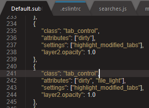
I update ST3 and my modified tabs are gone and replaced with barely viewable line at top of tab, how do I revert back to color of modified file filename being highlighted, where are settings for this, I only see ‘opacity’ for the line at the top


I update ST3 and my modified tabs are gone and replaced with barely viewable line at top of tab, how do I revert back to color of modified file filename being highlighted, where are settings for this, I only see ‘opacity’ for the line at the top

You can customize the theme by adding rules to a file named Packages/User/Default.sublime-theme. Part of the last dev cycle was full documentation (and a bunch of new features) for the theme engine: http://www.sublimetext.com/docs/3/themes.html.
Yes I screenshot that file, see above? There is no option for color of modified filename, switching to color of filename instead of thin barely visible line at top of tab etc
No, I suggested creating a new, customizations file for what you want to do. You’ll probably want to add some new rules controlling the layers, perhaps tinting some things. You could make modified tabs bright red with blue text, or whatever you like. 
Come on guys I am trying to get some work done today not play around with settings that are not even there, can you just tell me what I need to add to get color of filename back instead of barely visible thin line
Honestly, at this point I have no idea what the old highlight modified tabs looked like.
I mean, you could just change the tint color of the line from the accent color to red, or something more high visibility. Or you could change the accent color for your color scheme. Or you could install a third-party theme that you like more.
Do you see the bright orange beautiful highlight of this modified tab ???
![]()
Why must you remove my modified tabs highlight with barely visible thin line and not make setting to revert back ???
Create Default.sublime-theme file in Packages/User folder with next contents:
[
    {
        "class": "tab_control",
        "attributes": ["dirty"],
        "settings": ["highlight_modified_tabs"],
        "layer2.opacity": 0.6 // Opacity of the top line
    },
    {
        "class": "tab_control",
        "attributes": ["dirty", "file_light"],
        "settings": ["highlight_modified_tabs"],
        "layer2.opacity": 0.8
    },
    {
        "class": "tab_control",
        "attributes": ["dirty", "selected"],
        "settings": ["highlight_modified_tabs"],
        "layer2.opacity": 1.0
    },
    {
        "class": "tab_label",
        "parents": [{"class": "tab_control", "attributes": ["file_light"]}],
        "attributes": ["dirty"],
        "settings": ["highlight_modified_tabs"],
        "fg": [255, 23, 0, 1.0] // RGBA color
    },
    {
        "class": "tab_label",
        "parents": [{"class": "tab_control", "attributes": ["file_medium"]}],
        "attributes": ["dirty"],
        "settings": ["highlight_modified_tabs"],
        "fg": [255, 23, 0, 1.0]
    },
    {
        "class": "tab_label",
        "parents": [{"class": "tab_control", "attributes": ["file_medium_dark"]}],
        "attributes": ["dirty"],
        "settings": ["highlight_modified_tabs"],
        "fg": [255, 161, 52, 1.0]
    },
    {
        "class": "tab_label",
        "parents": [{"class": "tab_control", "attributes": ["file_dark"]}],
        "attributes": ["dirty"],
        "settings": ["highlight_modified_tabs"],
        "fg": [255, 161, 52, 1.0]
    }
]
Here’s what I did (in a copy/pastable format), based on andihodev’s and st123’s work:
[
    {
        "class": "tab_control",
        "attributes": ["dirty"],
        "settings": ["highlight_modified_tabs"],
        "layer2.opacity": 0.0 // Opacity of the top line
    },
    {
        "class": "tab_label",
        "parents": [{"class": "tab_control"}],
        "attributes": ["dirty"],
        "settings": ["highlight_modified_tabs"],
        "fg": [255, 161, 52, 1.0] // RGBA color
    }
]
This removes the top line entirely, and colors dirty tab titles with the original orange from the previous builds of Sublime. This brings back the classic highlight_modified_tabs behavior.
If you like the top line, you can use this version:
[
    {
        "class": "tab_control",
        "attributes": ["dirty"],
        "settings": ["highlight_modified_tabs"],
        "layer2.opacity": 0.8 // Opacity of the top line
    },
    {
        "class": "tab_control",
        "attributes": ["dirty"],
        "settings": ["highlight_modified_tabs"],
        "layer2.tint": [255, 161, 52, 1.0] // RGBA color for top line
    },
    {
        "class": "tab_label",
        "parents": [{"class": "tab_control"}],
        "attributes": ["dirty"],
        "settings": ["highlight_modified_tabs"],
        "fg": [255, 161, 52, 1.0] // RGBA color for tab title
    }
]
Also, I’d like to point out that this is a completely unacceptable change to the way that dirty tabs are displayed by default. It’s totally unreasonable to expect the average user to even know that this Default.sublime-theme file exists, let alone how to edit it to bring back a useful feature from previous builds.
There really should be a general setting, perhaps highlight_modified_tabs_classic, that does what these esoteric theme changes do. Or at least make the existing UI element for dirty tabs significantly more visible. I would be happy with the change if I could actually see the damn line.
I am struggling with this problem with V4 gravity dark theme and monokai clour scheme. All the tabs are same colour hardly tell which one is which and where I am working. Can somebody put me out of my misery. Do I customise the theme or the colour scheme ? Will above code work for V4. I have switched from webstorm but setting up (eslint, prettier etc) sublime is a nightmare.